
Spot colours can add something special to your print project and they may even help reduce print costs in some cases. Below you will find an overview of the key facts on spot colours.
Want to print metallic or neon colours? No problem – colours that cannot be mixed using the four process colours cyan, magenta, yellow and key can be implemented using the so-called spot colours or solid colours. But first things first.
Process colours and colour mixing
Standard four colour print uses the four inks cyan (C), magenta (M), yellow (Y) and black/key (K),hence the name CMYK. These four print inks are also called process colours. CMYK printing uses layered dots of ink to simulate a full spectrum of colours. To produce green, for instance, specific percentages of yellow and cyan are printed over one another.
Spot colours
Spot colours or solid colours in contrast are premixed inks. In order to print green, all you need is therefore a can of premixed green spot ink.
Spot colours have some advantages over process inks. They allow printing colours that are impossible to produce by mixing the process colours. This includes, for example, metallic and neon colours but also gold and silver, opaque white and certain greens and blues. Depending on the shade, spot colours may also appear brighter. In so far, they are indispensable to complement the colour spectrum that can be implemented with process inks. But they cannot completely substitute process colours.
Colour fidelity
Colour fidelity is another reason to use spot colours. If you have ever painted with water colours, you will know that it can be quite challenging to mix blue and yellow to exactly the same shade of green every time. We face the same challenge when printing with process colours. Companies that use a specific colour as part of their corporate design printed on all their business correspondence may be disappointed to see slight colour deviations depending on the printing process and press even though the colour composition is the same each time. Such colour variations can be avoided by using ready-mixed spot colours.
Reducing the number of print passes
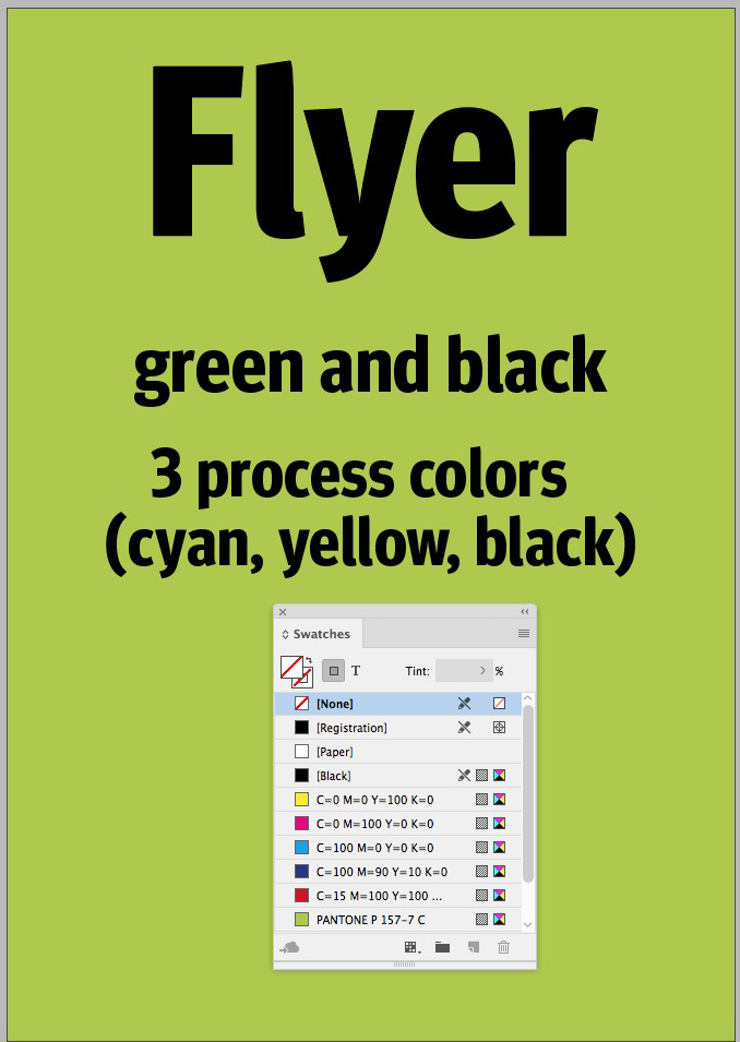
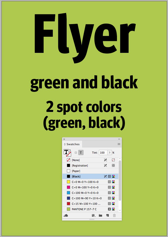
As explained above at the example of green, the use of spot colours can reduce the number of passes through the printing press which can ultimately be cheaper than CMYK in some cases. A flyer designed in green and black needs three passes when printed with process colours – cyan, yellow and black. But if the same product is printed with spot colours, only green and black are necessary and thus only two passes. However, the costs saved are frequently offset by the higher price of spot colours compared to CMYK inks.
Now if we add red as a third colour to our design project, both printing methods would require three passes. When printing even more colours (and coloured images), process colours are again indispensable.
Often it is recommended to use a combination of the two, i.e. you print with process colours and add a fifth spot colour to implement neon text, metallic elements or the brand colour, for example. To learn how to set up a fifth colour in your artwork, read The 5thcolour:relief varnish, UV coating and spot colours.
Pantone and HKS
Pantone and HKS produce commercially available spot colours. Both manufacturers present their colour gamuts on colour charts available on different paper types and for different applications.
Pantone is known worldwide as a colour provider and its products are commonly used. The company differentiates between three different paper stocks: coated paper (C), uncoated paper (U) and matte paper (M). Moreover, Pantone offers ready-made colour charts for specific colour groups such as metallic and neon colours.
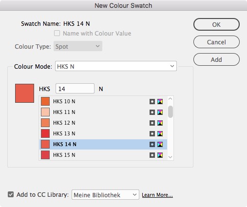
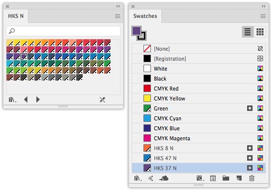
HKS colours are mainly used in Germany. The manufacturer distinguishes between coated paper (HKS K), natural uncoated paper (HKS N), newspaper (HKS Z) and continuous form paper (HKS E). Each spot colour is characterised by a number and a letter for the paper resulting in a clearly structured system.
Process and spot colours in InDesign
Both manufacturers are represented in standard software products, notably InDesign and QuarkXPress. Both HKS and Pantone spot colours are set up using colour swatches in these two programs.
Setting up spot colours in InDesign
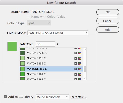
To set up HKS and Pantone colours, choose New Color Swatch from the Swatches panel menu (if it is hidden, show it via Window > Color > Swatches). Press Shift to select multiple colours and add them all at once.
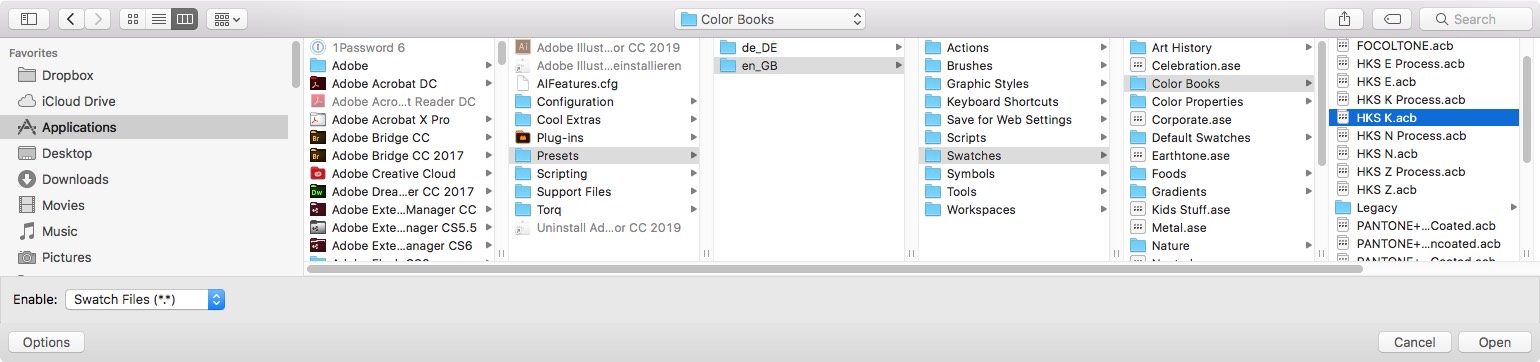
To load the entire range of spot colours into your layout program, you have to take a detour. In InDesign, the swatch libraries are located in the folder
C:\Program Files\Adobe\Adobe InDesign CC 2019\Presets\Swatch LibrariesIn Photoshop this is different: Here you can load complete swatch collections in the Swatches panel with a mouse click.
Determine the colour type
![Screenshot of the Swatches panel in Adobe InDesign, featuring a range of color swatches including [None], [Registration], [Paper], [Black], various CMYK colors, plus spot colours like PANTONE and HKS swatches.](https://www.onlineprinters.ie/magazine/wp-content/uploads/2019/05/spot-colours-swatches.jpeg)
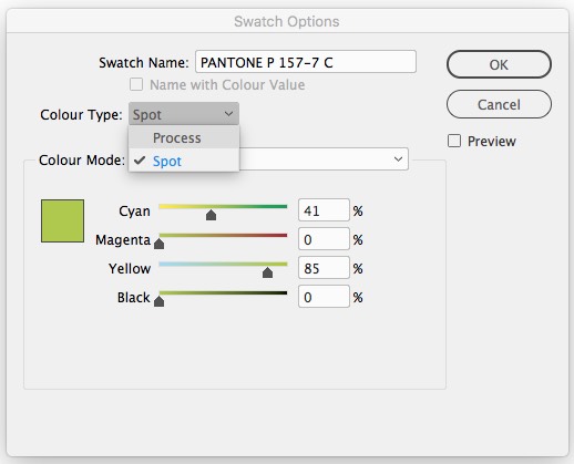
In the overview of the Swatches dialog box, you can see which colours you presently work with: Process colours that are printed on four separate plates have a grey box to the right of the colour specification; spot colours in contrast are represented by a box containing a small grey circle. These two icons indicate the status which InDesign refers to as the colour type and which is relevant for colour output.
The second icon indicates the colour mode which only affects the type of mixing when setting up the colour in InDesign. The CMYK icon here only means that these colours were mixed in CMYK mode but this will not affect the output. Alternatively, a colour mixed in RGB mode will show the RGB icon; HKS and Pantone can be selected, too. But bear in mind that if you chose HKS mode here but selected CMYK as the colour type, the HKS colour will be separated in the four process colours and not output as a spot colour.
Converting colours in InDesign
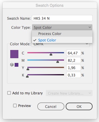
Both categories, the colour type and the colour mode, can also be changed at a later time. This means that you can convert each spot colour to a process colour and vice versa. In the Swatch dialog box you can generate new colours. The associated Swatch Options dialog allows you to change the colour type and the colour mode.
So if you initially choose to use Pantone and HKS colours for your design project but change your mind later in the process, you can change the colour type to convert any spot colour to process.
Spot colours can be changed to CMYK in InDesign and other programs at any time. In this case, you don’t have the benefits of a spot colour and may experience colour shifts.
If you enable several spot colours at the same time, you can also convert them all at once. But bear in mind that this can produce the well-known colour shifts or that certain colours may not print at all.
Trust, but verify the output
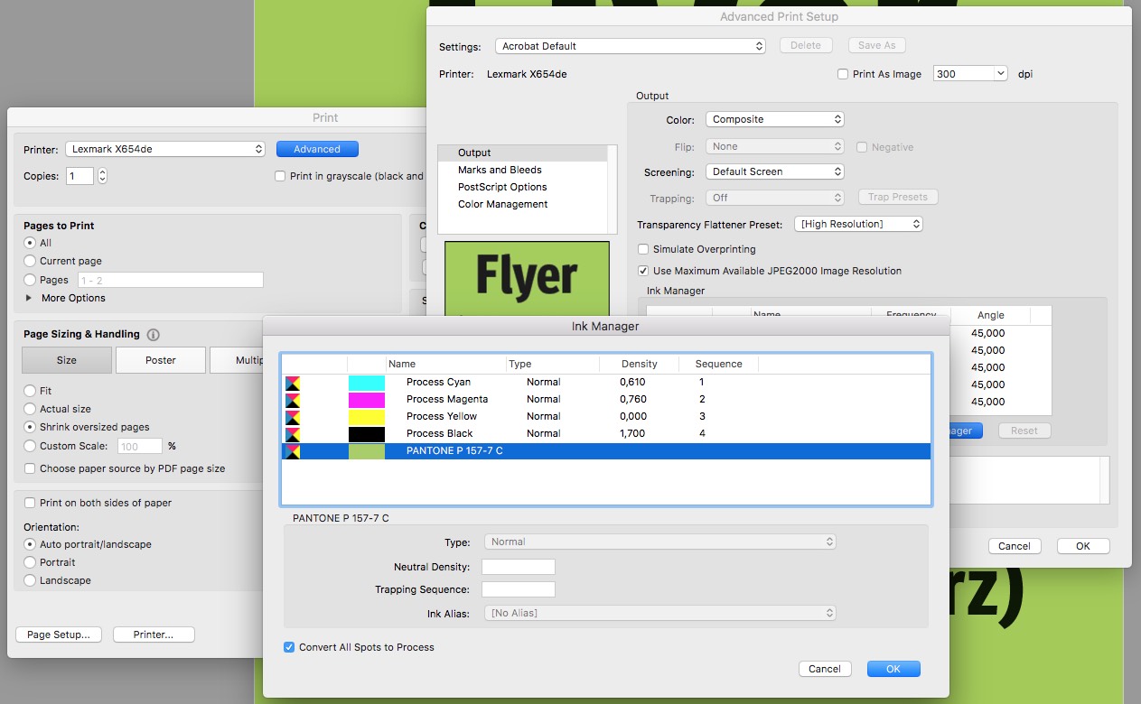
Check the print dialog of InDesign to verify whether the colours in your document are actually output as desired. In the Print dialog box, choose Separations in the Color drop-down list box in the Output section to display all colour separations to be output.
If only the four process colours are displayed here, no spot colours will be used. If the document contains spot colours, these will also be listed in the overview with their name.
Click the printer icon to prevent output of the corresponding colour separation. Click the Ink Manager button to open the Ink Manager dialog in which you can check and convert the colours.
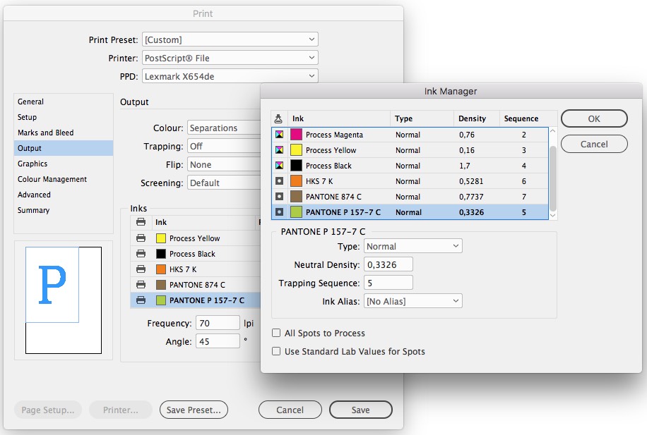
To get a quick overview while working on a layout, you can also use the Output · Separations Preview window which shows the necessary colour separations.
Setting up and converting colours in Adobe Illustrator
To use Pantone or HKS colours in Adobe Illustrator, the first step involves a bit more work since the colours cannot be initially accessed through the swatch options but have to be loaded.
Choose Open Swatch Library > Other Library from the Swatches panel menu to be taken immediately to the en_US folder. Here, choose Swatches > Colour Books subfolder to navigate to predefined colour charts including Pantone and HKS. If you click on a colour book, Illustrator will open it in a separate window.
The process of defining the colour in Adobe Illustrator is very similar to that in InDesign. The colour type is decisive for the output here, whereas the colour mode has no influence as in InDesign.
If you display the colours by their name, you will also see icons to the right of the colour names as in InDesign: Spot colours are represented by a white circle in a dark box; process colours are displayed without an icon. The second icon again represents the colour mode.
Global process colours are easily identified in Illustrator’s swatches palette by their empty white triangle in the lower right corner of the swatch. Spot colours are always global; a global spot colours has a black dot in the white triangle.
Converting colours is therefore similar. To convert a spot colour to process, open the swatch options of a colour and then change to CMYK colour mode. Subsequently, change the colour type from spot to process colour.
Final check in Adobe Illustrator
In Adobe Illustrator you can also verify the settings in the Print menu. Click Output > Separations under Mode. Click on the printer in front of the colour separation name to enable and disable the output of the respective colour. Click the colour icon to convert the spot colour to process.
Verifying spot colours in Acrobat
In a PDF document you can also check which colours were used in the document. The free Reader is not up to the task, but you can use Adobe Acrobat Pro to check the colour space of a PDF file.
Use the Preflight tool in the Print Production panel to check and change the colour systems of your document based on detailed profiles also with regard to its colour types. To check and if necessary change the colour separations, choose Print Production > Ink Manager. This dialog box lists all spot colours set up in the document that would also be output as an additional colour. Click the “Convert All Spots to Process” check box at the bottom of the dialog box to convert the spot colours to process.
In the Print menu of Adobe Acrobat Pro you can make one last check. Click Advanced to also show all colour separations here. If you change your mind at this point, click Ink Manager to open the above dialog which also provides the conversion option.
Print-specific settings for finishes
In addition to the benefits and special characteristics of spot colours described above, certain print techniques also require using these colours.
Onlineprinters optionally finishes your products with coatings and foils. Even though these finishes are not inks strictly speaking, many such finishing options are treated in the same way as a fifth colour.
So you have to set up a fifth colour as a spot colour when applying blacklight ink, raised varnish, UV coating and silver foil to parts of your design. This spot colour must be applied to all areas to be finished. Depending on the finishing option, the spot colour must have a specific name and a certain colour. For more details, refer to the data sheet of the finishing option and read the article The 5thcolour:relief varnish, UV coating and spot colours.