
If two or more colours are placed in a direct relationship to each other, they create a completely new effect depending on their respective properties and their combination.
The Swiss art teacher and painter Johannes Itten (1888 – 1967) systematised such interactions between adjacent colours. He defined seven colour contrasts based on a colour wheel he developed and which are still an integral part of modern design theory today.
Before looking at the various colour contrasts, however, it makes sense to take a closer look at Itten’s colour wheel.
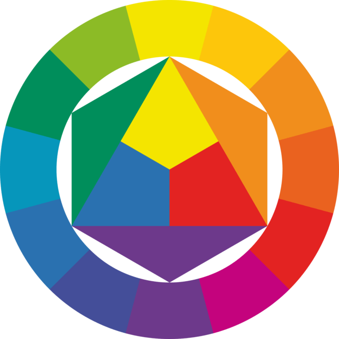
Itten’s well-known twelve-part colour wheel is based on the three basic or primary colours red, yellow and blue, from which the three secondary colours orange, green and violet can be mixed. If the primary and secondary colours are mixed, six further mixed colours are created, the so-called tertiary colours (orange-red, dark yellow, light green, blue-green, blue-violet and purple-red).
Over the years, however, Itten’s model came under criticism from Harald Küppers, a German printing technician. He noted that the colours opposite each other in a colour wheel – so-called complementary colours – should physically always result in grey. However, Itten’s complementary colours actually produce brown, dirty shades when mixed.
Küppers also criticised the fact that Itten paid no further attention to the colours black and white in his colour wheel.
Regardless of Küppers’ criticism, it can be observed that colour mixtures carried out according to Itten’s colour theory are difficult to mix and not always easy to understand.
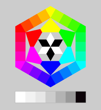
In his own hexagonal colour model, Küppers then presented his eight basic colours: the primary light colours red, green and blue – according to Küppers orange-red, violet-blue and green -, the primary printing colours cyan, magenta and yellow as well as black and white. These primary colours result in a much higher number of mixable colours than is practically possible with Itten’s colour theory. In addition, both types of colour, screen colours and print colours, are accommodated in one model.
Küpper’s colour theory is therefore of particular interest to media designers and will be included in the following consideration of Itten’s seven colour contrasts.
The 7 colour contrasts
1. Colour-in-itself contrast (or colour contrast)
The colour-in-itself contrast with Itten’s primary colours red, yellow and blue (left), the secondary colours orange, green and violet (centre) and pastel mixed colours (right).
The colour-in-itself contrast is created when at least two pure colours are combined.
The contrast is particularly high when pure, strong colours are chosen that are far apart on the colour wheel. An example of this is the combination of Itten’s primary colours red, yellow and blue.
With its unadulterated colours, the colour-in-itself contrast appears very colourful, striking and strong. It is associated with characteristics such as cheerful, bright, carefree but also naive, garish and loud.
In advertising, the contrast quickly attracts attention. It also embodies vitality, versatility and creativity.
However, the combination of several colour tones can also appear intrusive and garish. To counteract this, the brightness and saturation of the colours is reduced, for example. Softer, pastel colours have a calming and less loud effect. The combination of mixed colours also usually has a more pleasant effect on the viewer, as they are less intense than pure colours.
2. Complementary contrast


Complementary contrast is an extreme form of colour-in-itself contrast that is created by combining two complementary colours.
Complementary colours are colours that are opposite each other on the colour wheel – for example, according to Küppers, the colour pairs red and cyan, green and magenta or blue and yellow.
The contrast between two complementary colours appears very extreme and lively, as the colours reinforce each other’s effect. This is an advantage that designers utilise to make motifs, designs or advertising look even more impressive.
As with the colour-in-itself contrast, the combinations of complementary mixed colours also lead to a softer contrast with the complementary contrast.
Do you know this phenomenon?
When two complementary colours are placed next to each other or combined as text and background, our sense of sight is overstimulated. This results in “flickering” at the boundaries between the colours, which creates an unpleasant impression. This flickering can be reduced, for example, by adjusting the brightness of one or both colours.
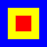
3. Light-dark contrast (or brightness contrast)
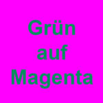
The strongest light-dark contrast on the left: black/white. In the centre, a font example with yellow lettering on a blue background. On the right, an example showing the poor legibility of green on the complementary colour magenta.
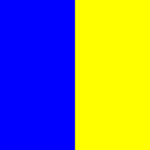
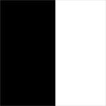
In light-dark contrast, a light colour is juxtaposed with a dark colour. Bright colours as well as black, white and grey are used, with the combination of black and white forming the most extreme contrast.
Especially for logos, flyers, posters or pictograms, a strong light-dark contrast is striking, easy to read and memorable.
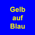
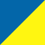
In addition to the classic combination of black lettering on a white background, light-coloured text elements look best on dark surfaces. When placing coloured text on coloured surfaces, it is advisable to choose colours that differ greatly in brightness. Of the pure, bright colours, yellow and blue form the strongest contrast between light and dark. A text in bright yellow stands out very well on a blue background and is easy to read.
The complementary colours magenta and green, on the other hand, show the smallest difference in brightness. Such colour combinations, which do not provide sufficient light-dark contrast, are less suitable for texts.
However, the light-dark contrast also plays an important role in photos. In black and white photography, it is the strong contrasts between light and dark elements that make a motif interesting and contribute to the spatiality and depth effect. The focus in the image can also be influenced by the contrast between light and dark: Lighter elements stand out in contrast to a darker environment and are thus quickly tapped into as the most important part of the whole.
4. Cold-warm contrast
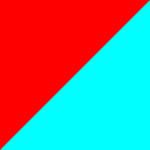
On the left the most extreme cold-warm contrast red/cyan. Next to it two further examples of mixed colours.
According to our perception, we divide colours into warm colours and cold colours. We assign colours such as red, orange or yellow to the “warm” category. In contrast, bluish green tones, cyan, mid-blue and blue are considered “cold”. The colours green and magenta cannot be assigned quite as clearly.
In the cold-warm contrast, cold and warm colours face each other. These colour combinations have a very intense and expressive effect. They are also subjectively associated with many other characteristics: shady or sunny, calming or stimulating, far or near, light or heavy and damp or dry. These pairs of contrasts can be excellently illustrated with the use of cold and warm colour tones.
Incidentally, the most extreme cold-warm contrast is formed by the complementary colours red and cyan, as red is classified as the warmest and cyan as the coldest colour.
5. Quality contrast (or also saturation contrast or intensity contrast)
The colour quality describes the degree of purity or saturation of a colour.
If pure, saturated colours are combined with less saturated variants, this is referred to as a quality contrast.
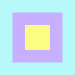
To reduce the colour quality of a colour such as magenta or green, the colours black, white or grey as well as the complementary colour can be added to it. This makes the colour cloudy, dull and greyish. If the saturated colour is now placed in contrast, it automatically stands out, as desaturated shades fade into the background – they literally fade next to the bright colour. Such combinations appear calm and balanced, but at the same time not very striking and eye-catching.
In order to achieve higher-contrast gradations of a colour, the brightness of the colour can also be changed in addition to the saturation. These colour gradations are perceived as particularly harmonious and are usually used in monochromatic, i.e. single-colour, designs.
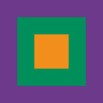
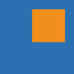
Coloured-uncoloured contrast
The coloured-uncoloured contrast is a special form of quality or saturation contrast. It is not one of Itten’s seven colour contrasts, but should be mentioned here as it is of great importance in design.
The chromatic- achromatic contrast describes the juxtaposition of bright colours and achromatic colours, i.e. black, white and grey.
If bright colours are placed on black, they appear bright and particularly present – with the exception of dark shades.
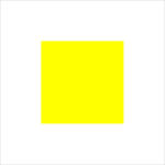
Colours appear friendly on white. However, it should be noted that very bright colours, such as yellow, are less effective on a white background than on black.
When combining colours with grey, the difference in brightness between the colours and the grey tone is very important. The more similar the brightness values of a colour and the grey are, the less effective they are.
6. Quantity contrast (or also area contrast)
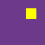
Quantitative contrast is not directly a colour contrast. Itten is actually referring to the proportions or surface ratios in which colours are placed in relation to each other.
Warm, light colours are perceived more strongly than cold, dark colours. Yellow elements, for example, immediately catch the viewer’s eye, whereas violet elements of the same size appear inconspicuous and subtle.
In order to effectively direct the impact of the colours – especially in relation to each other – they can be coordinated in terms of their surface size.
For a calm, balanced effect, warm colours with a high luminosity should take up a smaller proportion of the surface than cold colours with a low luminosity. In our example colour combination of yellow and violet, this would mean that the yellow element should be considerably smaller than the violet element so that both colours have the same effect.
However, it should not be forgotten that unequal colours create tension and activity and that surface contrasts should therefore be chosen consciously and carefully depending on the intention.
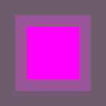
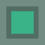
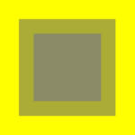
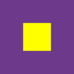
7. Simultaneous contrast
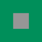
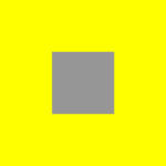
Simultaneous contrast is an optical phenomenon in which a colour is influenced by its surrounding surface.
For example, if we look at a neutral grey square on a green surface, we notice that the grey appears warm and almost reddish. In contrast, the same square with the same shade of grey appears cool and slightly bluish in front of a yellow surface.
This subjective impression arises because when we look at a colour, our sense of sight always tries to create the matching complementary colour in its surroundings. Our eyes therefore endeavour to find a balance.
This phenomenon may be less important when designing flyers, posters or brochures – however, it should always be borne in mind that every background colour and every coloured area has an influence on the elements placed on it. This plays a particularly important role in corporate design, for example when it comes to placing a colour logo on coloured background areas.
With complementary colours, the simultaneous contrast enhances the colour effect. For example, yellow appears brighter and purer against violet than on other colours.
Image sources:
Fig. 1 – Ahrens Malte: Twelve-part colour circle according to Johannes Itten (1961) (https://de.wikipedia.org/wiki/Datei:Farbkreis_Itten_1961.svg)
Fig. 2 – Hewin: The basic scheme of colour theory according to Harald Küppers (1976) (https://de.wikipedia.org/wiki/Farbkreis#/media/File:Farbenkreis_k%C3%BCppers_svg.svg)