
Old fonts add charm to your designs and usually trigger associations that can be harnessed for communication and marketing purposes. Travel through time with us and discover exciting historical fonts.
An eye-catching font makes your project stand out from the crowd. In addition to drawing attention, historical fonts convey certain feelings and evoke images of a particular time period or theme in the mind of the viewer.
Gothic fonts, for instance, create a distinct medieval feel, making them ideal to advertise a medieval fair. Nostalgic handwritten fonts are associated with romantic love letters and Art Deco typefaces bring the Roaring Twenties back to life. However, you should first do a group brainstorming to identify potentially unwanted associations the fonts may trigger. After all, everyone uses their imagination to create different mental images.
Tip: We have checked the commercial availability of all fonts, but we cannot warrant this. So please check out the license information and notes on the website you are downloading your font from.
Antique style typefaces
The ancient Romans and Greeks wrote on papyrus or parchment or carved inscriptions in stone. This would be impractical today, but we can use antique fonts to capture the spirit of ancient Greek and Roman writing styles.
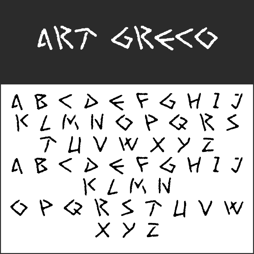 Art Greco
This Greek-looking font is not an exact replica of ancient scripts (nor does it represent the modern Greek alphabet), but it shows a Greek influence which is especially popular in the hospitality sector. It is ideal for all themes related to the ancient Greeks.
- License: Free personal use, contact the author for commercial use (http://www222.pair.com/sjohn/fonts.htm), readme file in the ZIP folder
- Download: .zip file
- Font format: TTF
- Design: Cumberland Fontworks
- Uppercase letters only, no special characters, no numbers
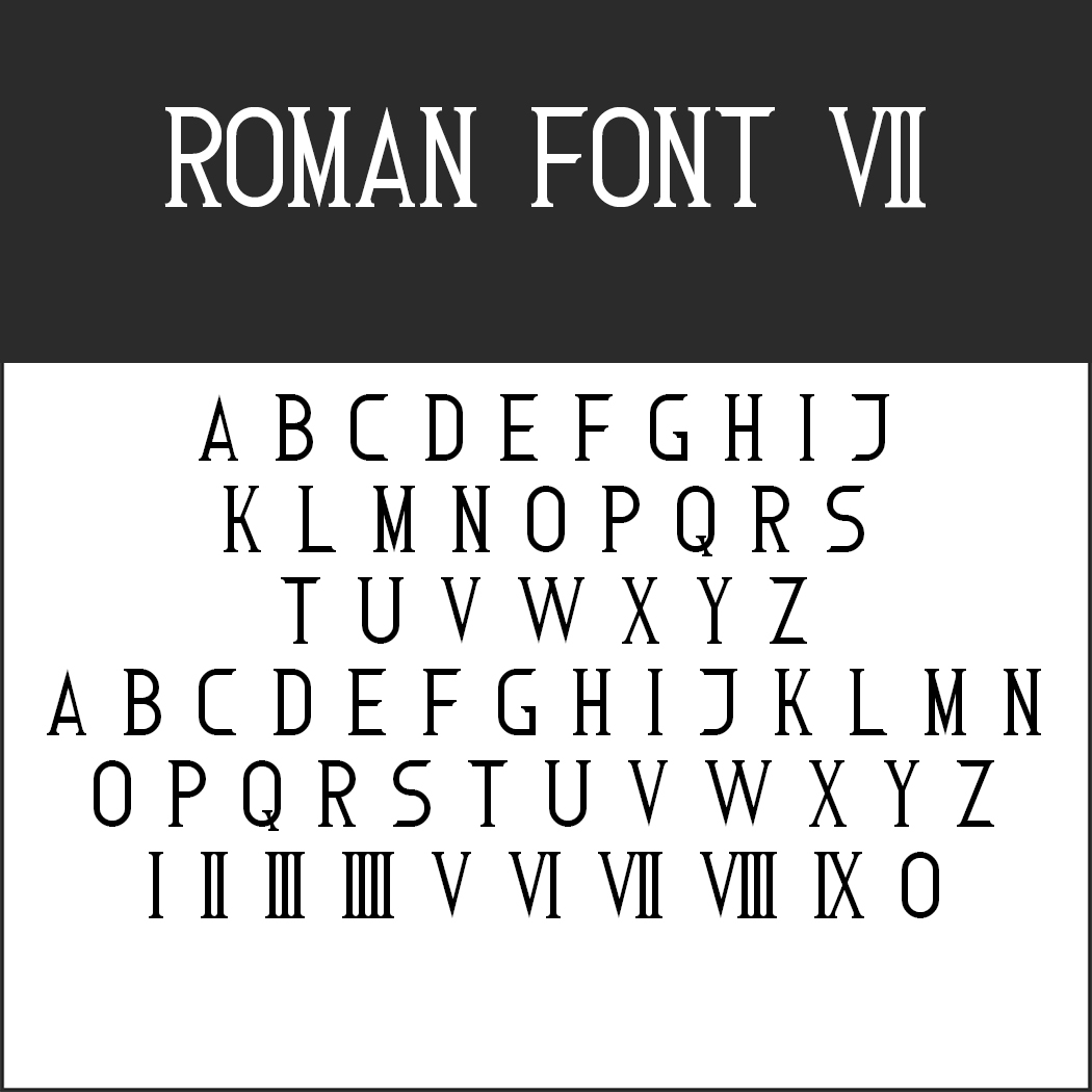 Roman Font 7
This Roman-style font looks as though it is carved in stone. Uppercase letters only; numbers can be written using Roman numerals.
- License: Free personal use, contact the author for commercial use (http://www.styleseven.com), readme file in the ZIP folder
- Download: .zip file
- Font format: TTF
- Design: Sizenko Alexander
- Uppercase letters only, no umlauts, no special characters, no numbers
Renaissance and medieval fonts
As Christianity spread across Europe during the Middle Ages, Roman influence declined which also reflected in font design: Letters got rounder in shape. Scripts underwent another significant change with the advent of Gothic and Renaissance fonts later on.
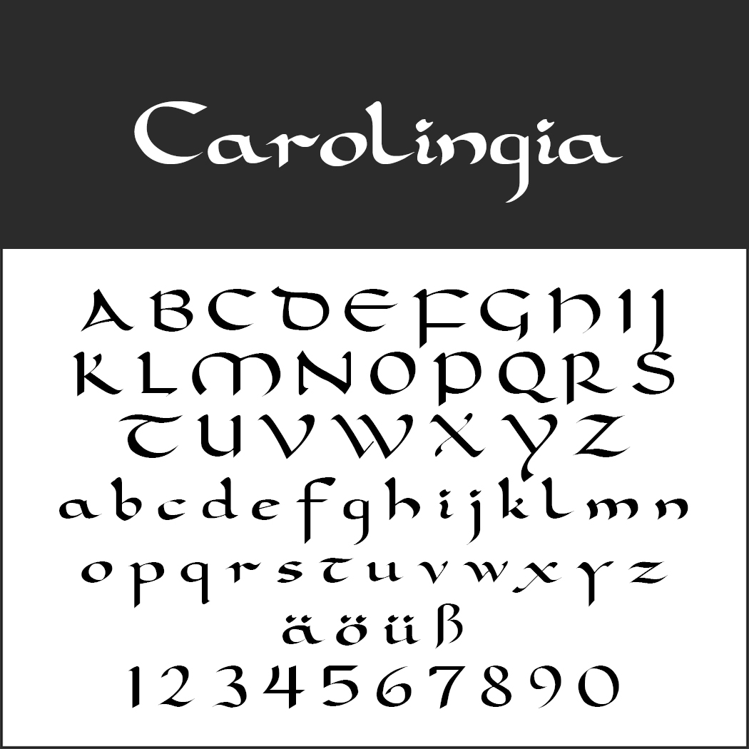 Carolingia
With the beginning of the Carolingian rule in the late 8th century, monasteries began to develop their own script. William Boyd’s font is based on this Carolingian minuscule script.
- License: Free for commercial and private use
- Download: .zip file
- Font format: TTF
- Design: William Boyd
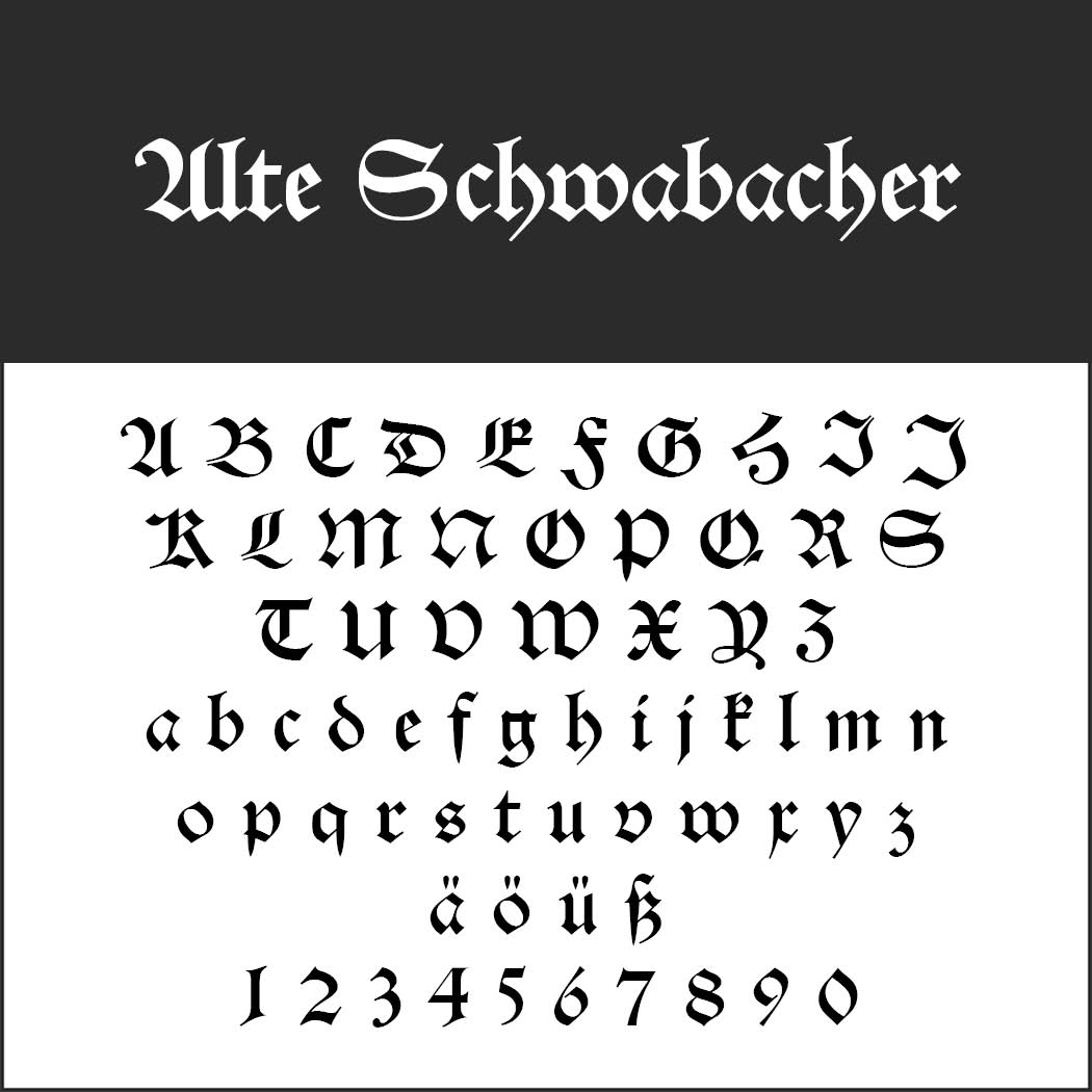 Alte Schwabacher
In the 12th century, the letters became more angular and the flow of writing “broken up”. Such typefaces are referred to as Gothic fonts. The Alte Schwabacher font created in the 15th century is a typical representative of blackletter typefaces.
- License: 1001Fonts Free For Commercial Use License (https://www.1001fonts.com/licenses/ffc.html), Readme file in the ZIP folder
- Download: .zip file
- Font format: TTF
- Design: Typographer Mediengestaltung, 2001
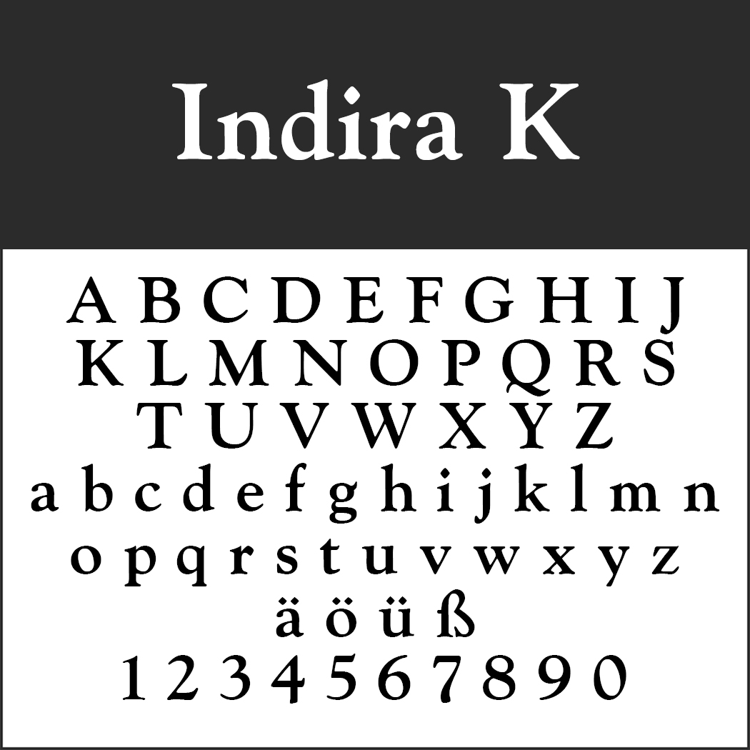 Indira K
New fonts evolved during the Italian Renaissance based on the Capitalis Monumentalis (Roman square capitals used for inscriptions in stone) and on the Carolingian minuscule. The resulting serif typefaces belong to the Renaissance Antiqua typeface class. Indira K is a modern interpretation which is more rounded than the original scripts and creates a more harmonious look.
- License: SIL Open Font License (http://scripts.sil.org)
- Download: .zip file
- Font format: TTF
- Design: Peter Wiegel (www.peter-wiegel.de)
Old fonts from the 18th and 19th century
The Antiqua font was further developed into the classicism period. In the German-speaking world, the cursive Kurrent font was commonly used in official correspondence.
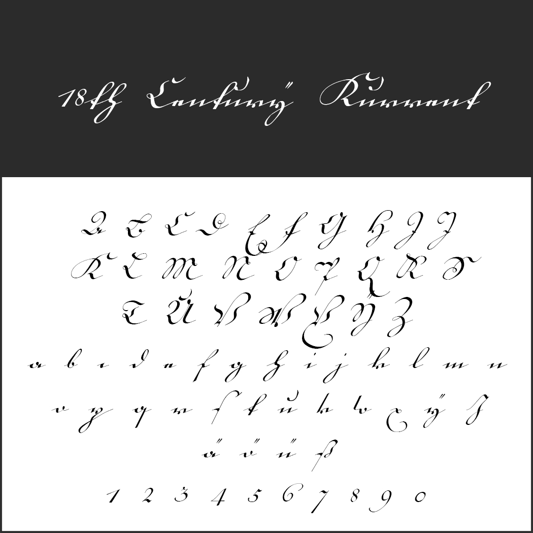 18th Century Kurrent
In 1788, a book was published in Strasbourg on how to use the German Kurrent, Kanzlei and Fraktur fonts. Peter Wiegel created a digitised version of one of these typefaces with his 18th Century Kurrent.
- License: SIL Open Font License (http://scripts.sil.org), readme file in the .zip folder
- Download: .zip file
- Font format: TTF
- Design: Peter Wiegel (peter-wiegel.de)
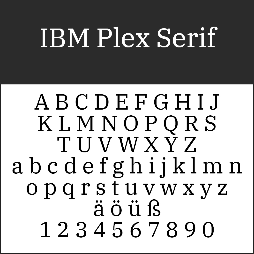 IBM Plex Serif
In the 18th century, Italian printer Giambattista Bodoni and his French competitor Firmin Didot developed hundreds of serif fonts. Some of these typefaces are still available under their original name with the classic Bodoni being the ultimate classic in this font family. Thanks to its timeless elegance, Didot is still popular today. The IBM Plex Serif font also evokes the spirit of that period and can be downloaded for free.
- License: SIL Open Font License (http://scripts.sil.org)
- Download: .zip file
- Font format: TTF
- Design: IBM (http://ibm.github.io/)
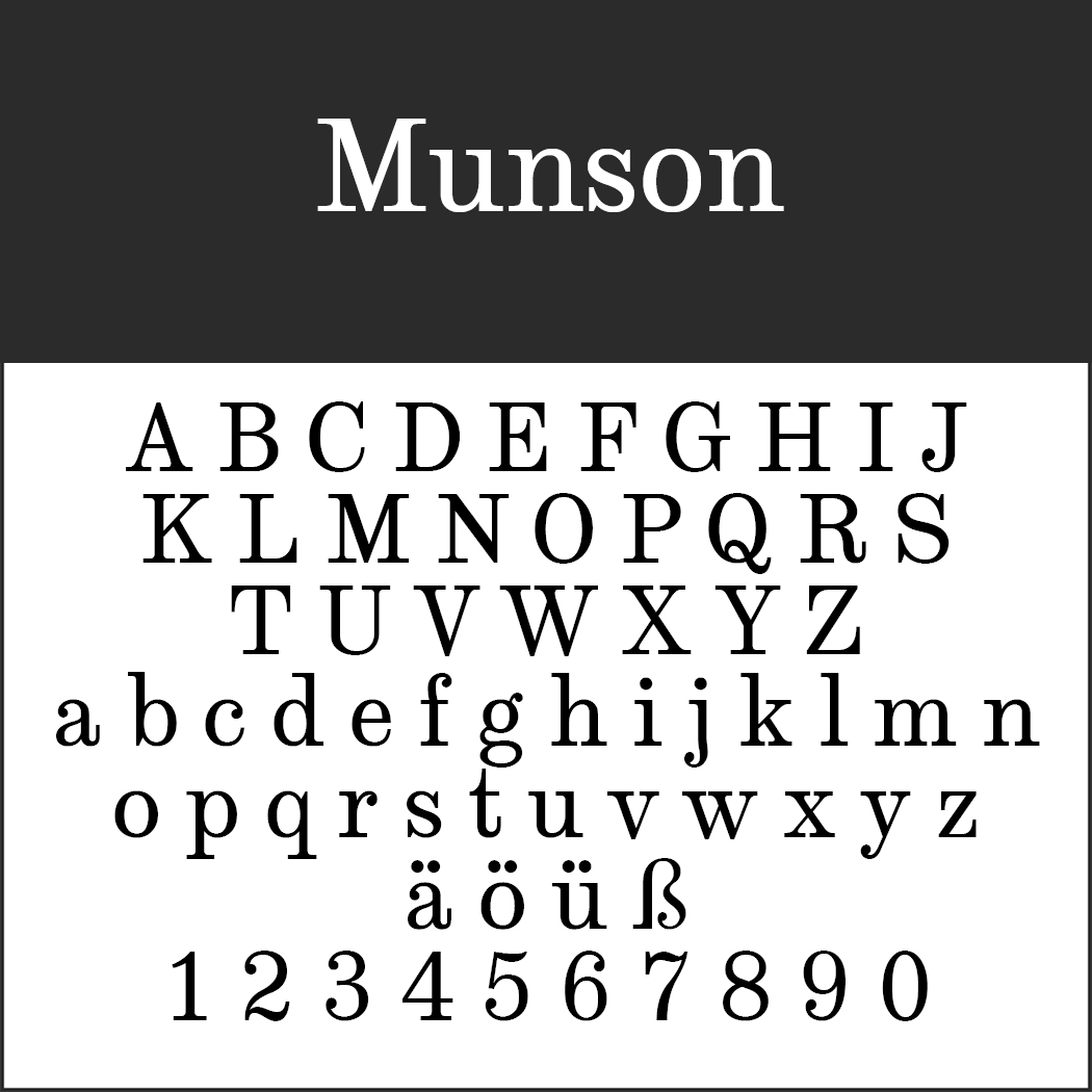 Munson
In the 19th century, Egyptienne, a slab serif typeface, gained importance. The Clarendon font from 1845 is a famous representative of this typeface family which is ideal for headlines. Munson is a Victorian-style combination of Clarendon and Consort from 1815.
- License: SIL Open Font License (http://scripts.sil.org), readme file in the .zip folder
- Download: .zip file
- Font format: OTF
- Design: Paul James Miller
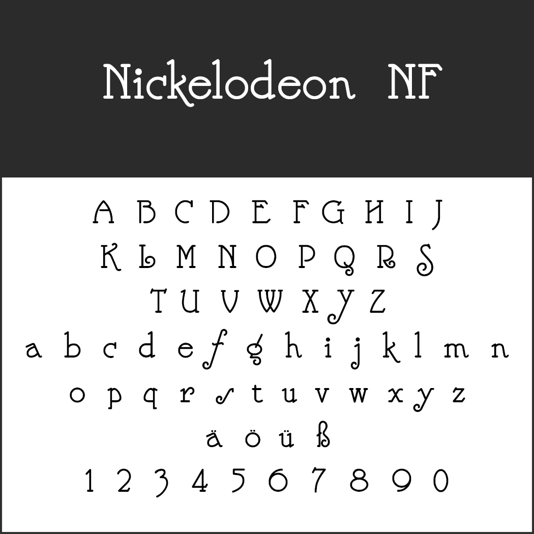 Nickelodeon NF
With technical novelties being introduced in the printing industry and advertising on the rise, designers experimented a lot with fonts. Baroque shapes and whimsical details characteristic of Art Nouveau were a hot trend. Nickelodeon NF is a modernised, rather restrained member of this font class.
- License: 1001Fonts Free For Commercial Use License (https://www.1001fonts.com/licenses/ffc.html), Readme file in the ZIP folder
- Download: .zip file
- Font format: TTF
- Design: Nick Curtis (http://www.nicksfonts.com/)
Old fonts from the 20th century
The 20th century brought many new developments but also preserved old traditions. Kurrent fonts (see “Cursive fonts“) and Gothic fonts were still popular besides new typefaces. Fonts originally devised for lead type were further developed and enhanced for use with the so-called Linotype machines.
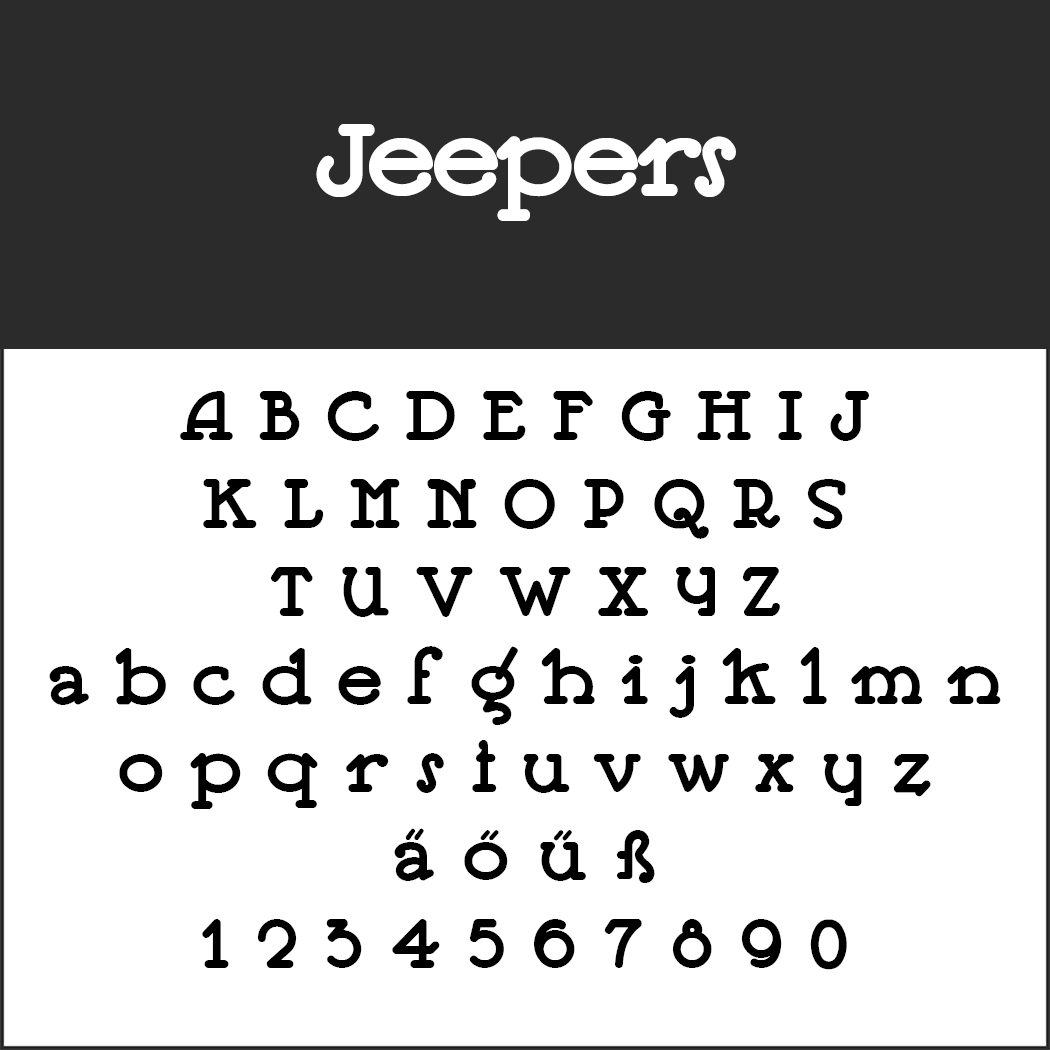 Jeepers
This carefully digitised font creates a very modern effect and was originally used for the poster of a German bookseller in 1924.
- License: 1001Fonts Free For Commercial Use License (https://www.1001fonts.com/licenses/ffc.html), Readme file in the ZIP folder
- Download: .zip file
- Font format: TTF
- Design: Nick Curtis (http://www.nicksfonts.com/)
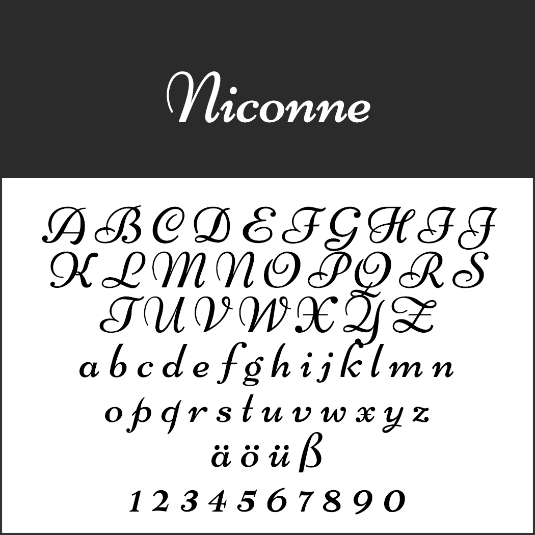 Niconne
Niconne is a digitised revival of the 1925 Madonna font. Optimized for web applications and mobile devices, it also looks great in print.
- License: SIL Open Font License (http://scripts.sil.org), readme file in the .zip folder
- Download: .zip file
- Font format: TTF
- Design: Vernon Adams
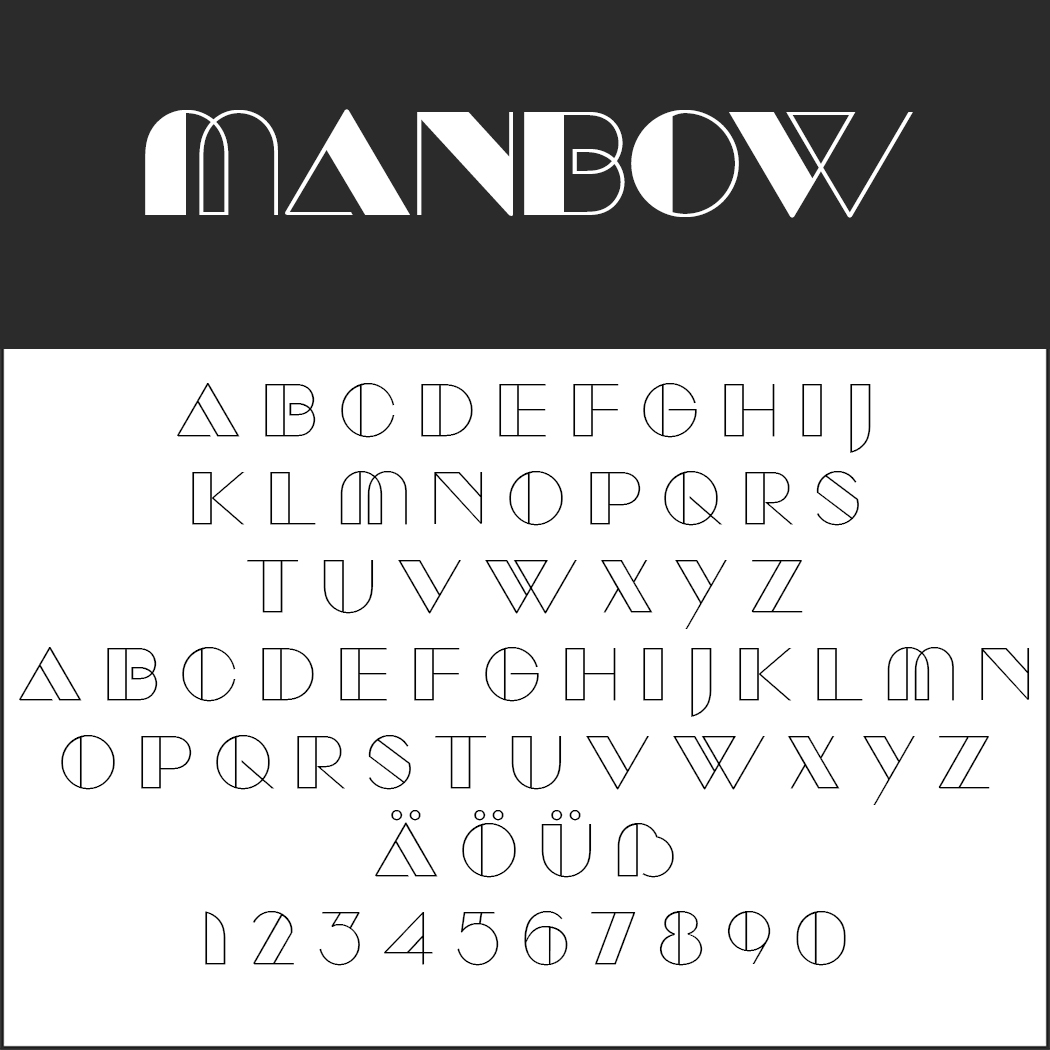 Manbow
This font looks like it jumped right off an Art Deco advertising poster and is a sure attention-grabber for many occasions.
- License: 1001Fonts Free For Commercial Use License (https://www.1001fonts.com/licenses/ffc.html), Readme file in the ZIP folder
- Download: .zip file
- Font format: TTF
- Design: Raymond Larabie (http://typodermicfonts.com/)
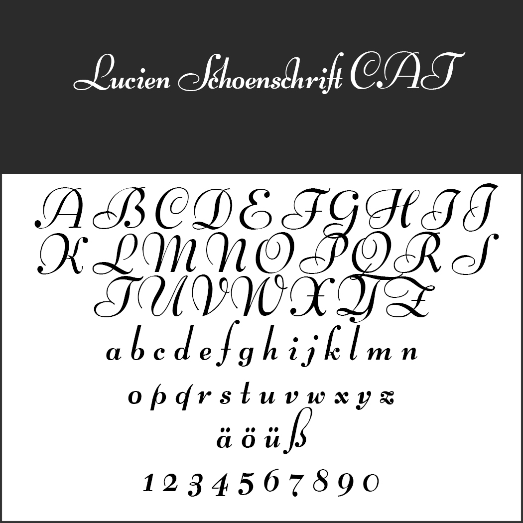 Lucien Schoenschrift CAT
This beautiful calligraphy font was developed by Lucian Bernhard in 1928. Having been digitised, it is now available for many decorative lettering projects.
- License: SIL Open Font License (http://scripts.sil.org), readme file in the .zip folder
- Download: .zip file
- Font format: TTF
- Design: Peter Wiegel (http://www.peter-wiegel.de/)
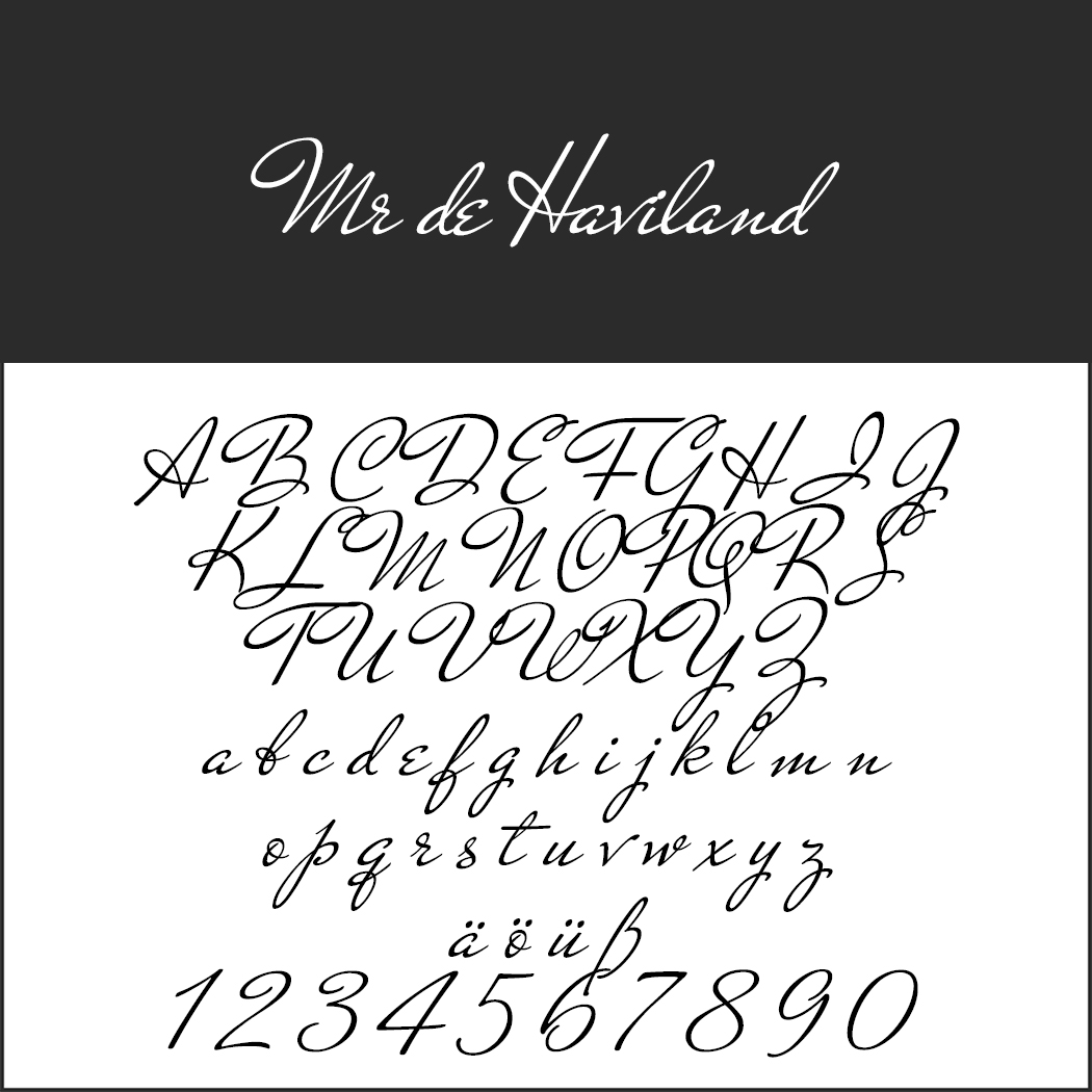 Mr De Haviland
This flamboyant font from the United States of the 1930s is not easily legible and therefore not suited for long body texts but ideal to show off eye-catching highlights.
- License: SIL Open Font License (http://scripts.sil.org), readme file in the .zip folder
- Download: .zip file
- Font format: TTF
- Design: Sudtipos (https://www.sudtipos.com/)
Discover more historical and vintage fonts on our themed website: