
Whether you add relief varnish, blacklight ink or a spot colour to highlight elements in your artwork, the steps required to do this are always the same in Adobe InDesign. This tutorial will demonstrate the process step by step.
Contents of this article:
- What is the fifth colour?
- The demo project
- Project setup
- Relief varnish
- Overprint
- Blacklight
- Spot colour
- Checking the fifth colour
Printing is more than putting ink on paper. A finish or spot colour enables you to add a special touch to your print project. Relief coating is very popular. It produces a raised tactile structure on a printed element such as text. UV ink or classic spot colours are other options to turn your artwork into eye-catching printings.
What is the fifth colour?
Because monitors transmit light, displays use the red-green-blue (RGB) additive colour model to reproduce a broad array of colours. In printing applications in contrast, it is all about CMYK: Cyan, Magenta, Yellow and Key (black). These primary colours, also called process colours, are used to “mix” all colours on the paper. In order for the print shop to know where to apply the special finish, the designer must supply the corresponding information in the artwork file. This information is transported by means of a fifth colour or a fifth colour channel. This new colour is applied to all elements which are to be spot coated, e.g., with relief varnish. When creating the artwork, the fifth colour is visible in the InDesign project but not in the final printed product.
The demo project
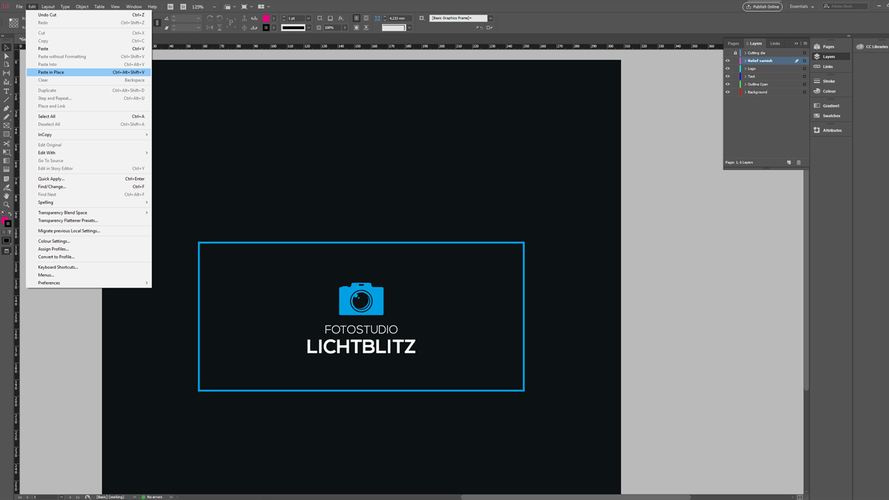
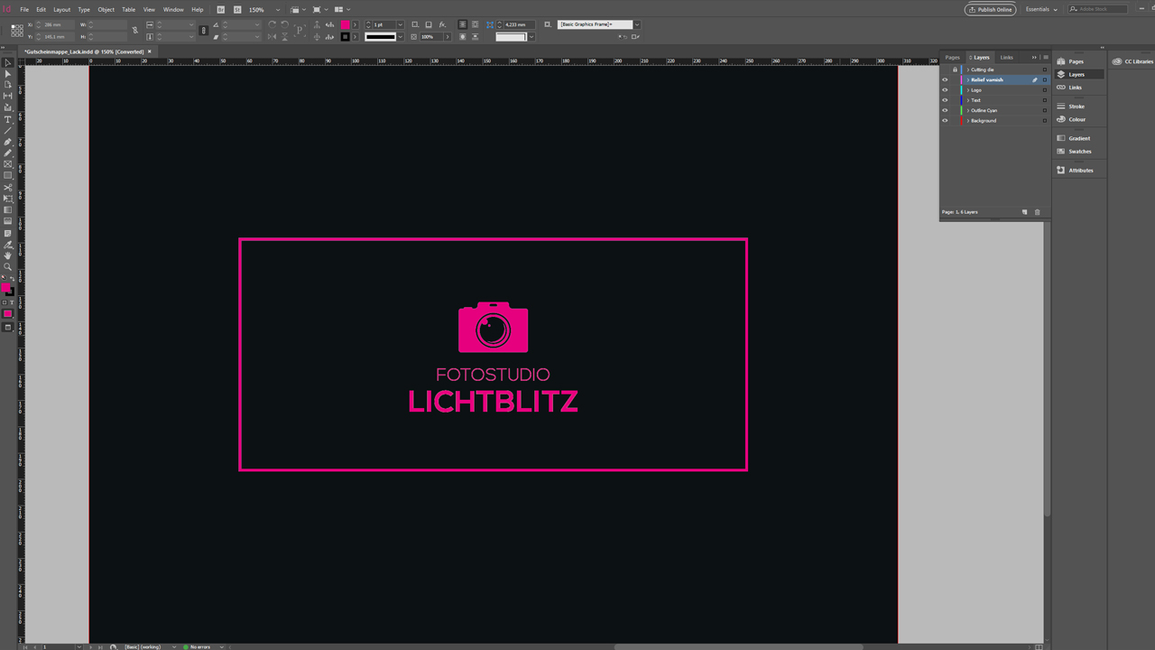
To illustrate this, we have invented a photo studio called “Lichtblitz”. They want to create relief-coated gift card envelopes with a special finish on the front. The front features a logo, the text “Fotostudio Lichtblitz” and a rectangular frame around these elements. Additionally, the artwork document contains a die-cut shape which is important for the print shop. We will use this project to illustrate the application of spot colour and UV ink.

Setting up the project
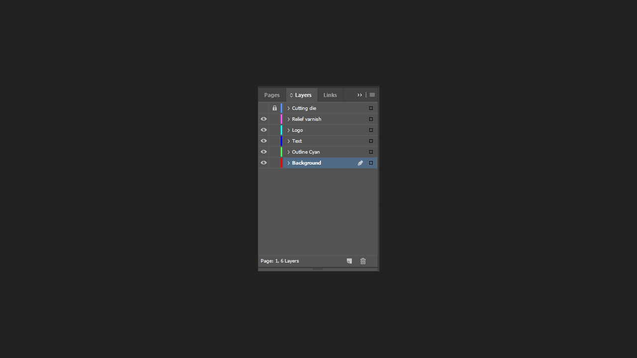
Stay organized to be effective. To keep your project clearly structured, place each element at a separate layer. Accordingly, each finishing method is assigned a separate layer that can be shown or hidden as desired.
Relief varnish
To design the artwork for relief coating, first create a new layer named “relief varnish” in the Layers panel. Next, select all elements to be relief-coated: the frame, the logo and the text in this case. Press Ctrl + C to copy these elements, select the “relief varnish” layer and paste the copied elements on this layer at exactly the same position with Edit > Paste in Place.
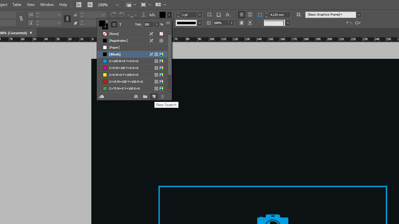
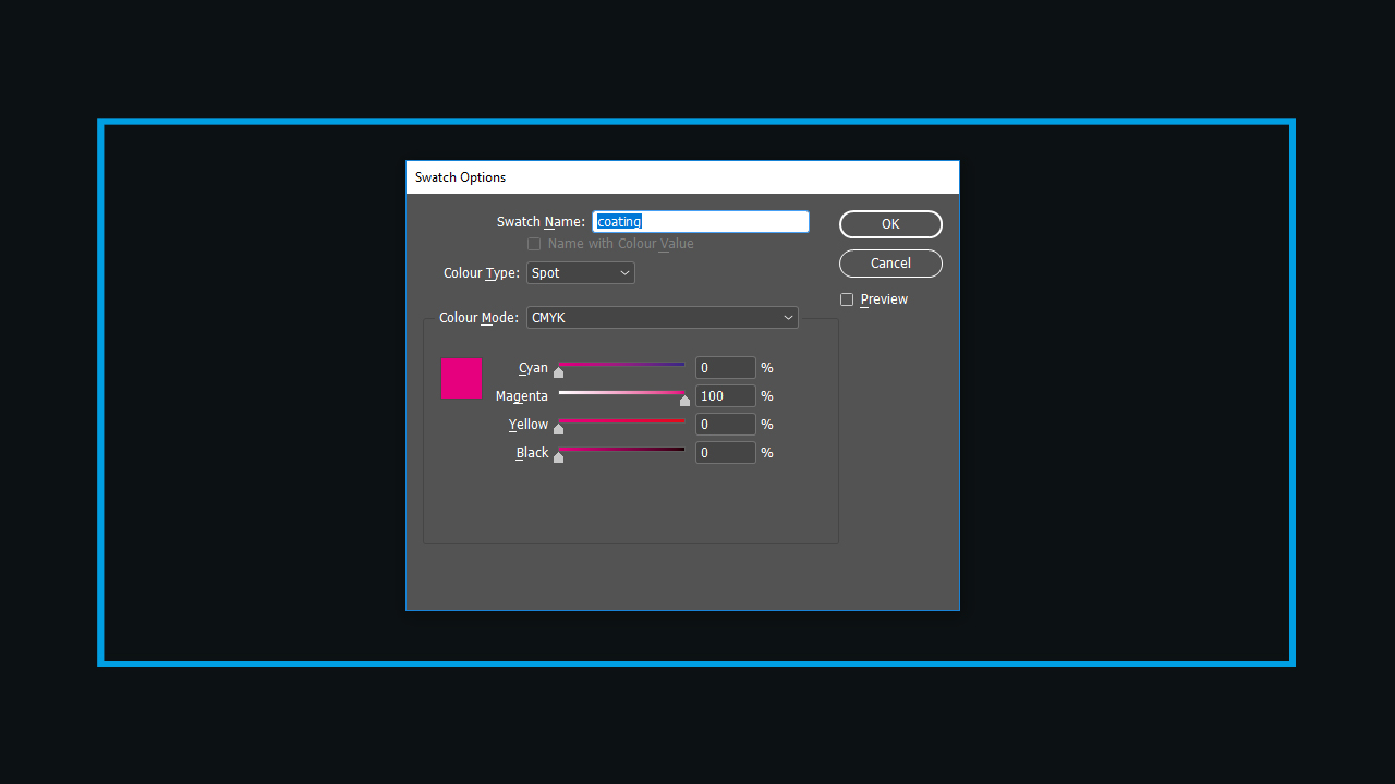
Now you can create the fifth colour. To do so, open the Color Themes in the top menu, choose any colour, black for example, and create a new colour by clicking the New Swatch button. Double-click the new colour swatch to open the Swatch Options.
Print shops usually make exact specifications for relief varnish. In our case, we will name the colour swatch “varnish”, change Color Type from “Process” to “Spot” and set Color Mode to 100 % Magenta.
Now you can colour all elements on the “relief varnish” layer using the newly created “varnish” colour. In the example, the whole front of the gift card envelope appears in magenta.
To prevent an all-magenta print result, you have to enable the “Overprint” setting.
Colouring vector graphics
In many cases, it is impossible to directly fill a logo like the one in our demo project with the “varnish” colour. This is because the camera logo is a vector graphic created in Adobe Illustrator and was pasted into our document as EPS. Being made up of vectors, its surface cannot be coloured directly in Adobe InDesign. To bypass this problem, open the logo in Adobe Illustrator, copy it withCtrl + C and Ctrl + V. Now you can colour it with the “varnish” paint.
Overprint
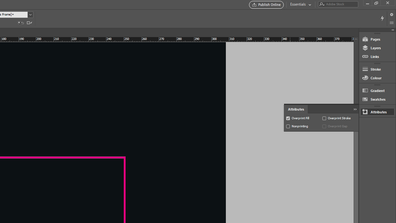
The “Overprint” setting assures that the “varnish” colour created previously is displayed in the project but not in the final product, at least not as a colour. Click Window > Output > Attributes to open the associated window. Once you have selected the first element with the “varnish” colour, the Overprint Fill or Overprint Stroke option in the Attributes window is enabled. The check mark indicates that the setting is active. This attribute has to be assigned to each future relief varnish element. This attribute assignment is the last step. It tells the print shops not to print magenta but apply the relief varnish.
Blacklight ink
Blacklight ink is used on forgery-proof event tickets, for example, because it is only visible under blacklight.
Design idea:
Create unusual event tickets.
The product is also great for other purposes such as
a party flyer with special effects.
To highlight the elements to be spot printed in blacklight ink, proceed analogously and first create a new layer named “blacklight”.
Notice:
Relief varnish additionally provides a raised texture to the graphic elements of the print whereas the blacklight elements are located at the UV layer only. This is because they will only be visible under UV light. But there are no fixed rules how to do this and thus virtually no limits to your creativity.
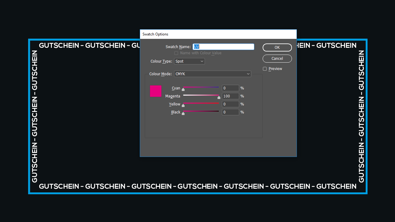
Next, create the fifth colour again using the Color Themes. There are clear specifications also for the UV ink in our case. Make the following settings: name the swatch “UV”, change the Color Type from “Process” to “Spot” and set the Color Mode to 100 % Magenta. All elements to be visible under blacklight are now directly coloured with the “UV” colour. Afterwards, assign the “Overprint” attribute to these elements.
Note:
The area of blacklight ink must not exceed 30 % of the total area of the printed product.
Spot colour
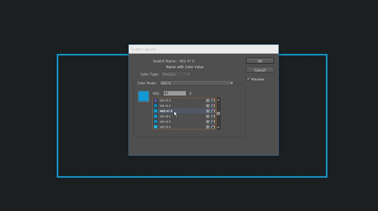
A spot colour is used when a specific colour cannot be mixed using the CMYK process colours. Various colour modes are available to this end such as HKS or Pantone. These colours are also created using the fifth colour (channel). First, create a new swatch using the Color Themes and double-click to open the Swatch Options. This time you don’t have to assign a separate name since it is assigned automatically when selecting the desired spot colour. Click Color Mode, which is set to CMYK by default, to open a list of other colour modes. Let’s assume that we use art print paper in this example. So we choose a spot colour from the HKS-K colour system which is especially designed for art paper. HKS-N is the ideal choice for natural paper. When you select the HKS-K colour system, InDesign will list all colours this system comprises. For the demo project, we select the colour HKS 47 K. When you click OK, the desired colour appears in the top color menu. Again, all elements to be printed in this spot colour must be coloured with it.
Check the fifth colour
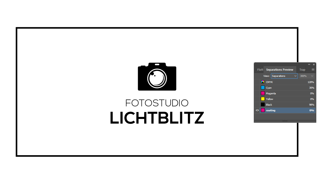
Before printing the project, you should verify that the artwork contains all elements to be spot coated. The Separations Preview allows viewing each colour channel individually for this purpose. To open the Separations Preview, click Window > Output > Separations Preview. In the following window, the view is set to Off by default. Click to open the drop-down menu and select Separations.
Click the eye icon next to the colour channels to show or hide the respective channel. You can now see why we use the terms “fifth colour” and “fifth colour channels”. The additional colour you created, whether spot colour, UV ink or relief varnish, is displayed here besides the CMYK process colours.
To check whether everything has been created correctly, the CMYK colours are hidden so that only the fifth colour is displayed. All desired elements should now be displayed in black here. If this is the case, you have set up everything correctly and the project is ready to be printed.
Credits:
By media designer Christoph Ullrich.