
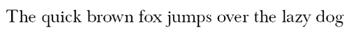
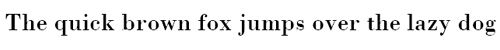
Serif fonts often exude a touch of nostalgia, but they can also create a very modern impression. There are free fonts to match every style. We have rounded up the best options for you.
A serif is a slight projection that finishes off a stroke of a letter. Font families that use such serifs are called serif typefaces. Antiqua is a term used in Germany to denote serif typefaces that mimic styles of handwriting or calligraphy called “Roman” in other parts of the world.
The difference between serif typeface and Antiqua
The terms do not follow a logical hierarchy in this case. Firstly, “Antiqua” is used synonymously with serif fonts in Germany, and secondly, it is the name of the typeface class which includes all fonts of Roman origin (in contrast to Fraktur-style typefaces where the individual strokes are broken apart). To avoid any doubt, the term “Antiqua typefaces with serifs” is also used occasionally.
The Antiqua typeface class is subdivided into three main font groups:
- Antiqua (serif)
- Egyptian (slab serif)
- Grotesque (sans serif)
The first two are serif fonts. Egyptian or slab serif fonts are characterised by thick, block-like serifs which have seen a revival in popularity over the past years. Modern fonts sometimes carry an affix in their name, especially if they are available in two variants, such as Roboto, which can also be downloaded as Roboto Slab. “Serif” is another extension and “Sans” is added to the name of grotesque fonts.
The main typeface class Antiqua (serif) is further divided into:
- Renaissance Antiqua (Old Style)
- Venetian Renaissance Antiqua (Humanist)
- French Renaissance Antiqua (Garalde)
- Barock Antiqua (Transitional)
- Neoclassical Antiqua (Didone)
Examples of the individual font groups are given below.
Using serif fonts
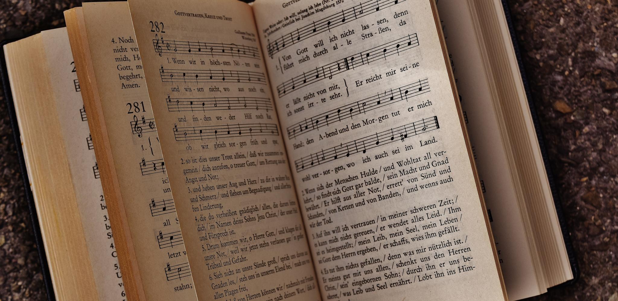
Although considered old-fashioned by some, serif fonts come in useful especially for long text passages and have clear advantages over grotesque fonts. The supposedly useless serifs help to guide the reader’s eye across the page, making serif fonts easier to read. For this reason, they are the first choice for lengthy text passages in all newspapers, most brochures and almost all books.
In contrast, there are some areas where sans serif fonts are better suited or used more frequently.
Serif fonts are less common in connection with:
- very small font sizes: Serif fonts are very difficult to read at small sizes because the serifs become blurred and impede legibility at font sizes of 8 pt and smaller. So it is better to use grotesque fonts for small print and similar applications.
- large font sizes: Sans serif fonts are often used for headlines mainly to set them apart from the other text passages (in serif font). But this can also be achieved by other means, so there is generally no reason not to use a serif font.
For example, the headline can also be printed in italics. Many newspapers also use a serif font for the headlines and a sans serif typeface for the sub-headline.
You should also be careful with extremely large font sizes as used on posters. Here you should test the desired font size first. This is because the tiny strokes in some serif fonts grow to such enormous dimensions that they impair the overall impression. - for web texts: Due to the lower resolution on screens, the serifs might not be displayed correctly, causing the font to appear irregular. However, this problem becomes less significant as the quality of monitors increases. Another reason is that many web designers considered serif fonts unsuitable to create a fresh and modern appearance. Today, serif fonts are making a revival and there are some very modern and new serif typefaces around. Accordingly, a web magazine can be designed in exactly the same way as a printed magazine, using serifs for the body text and sans serif fonts for the headings. But it is important not to forget the fallback fonts when using very fancy typefaces.
Classic serif fonts
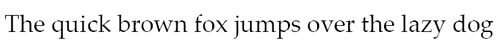
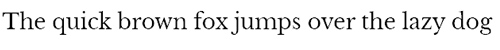
Some serif fonts were already so sophisticated centuries ago that they still look great in digital form today. A few of them, such as Bodoni and Garamond, are frequently used in magazines.
Garamond is one of the Garalde typefaces besides Palatino and Sabon.
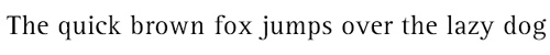
The Transitional typeface class comprises Baskerville, Rotis Serif and Times New Roman. Members of Didone are Bodoni, Clarendon and Didot.
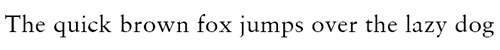
Georgia is a new antiqua typeface designed by Matthew Carter for Microsoft in 1993 and amended in 2011 and has been known as Georgia Pro since then. It is considered a modern serif classic.
An overview of classic serif fonts:
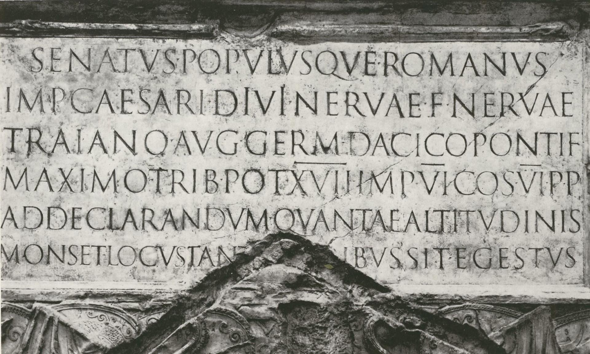
Why the already the Romans used serifs
It is commonly held that the little extra strokes can be traced back to ancient Rome. Opinions vary and some believe serifs were a technical necessity introduced to make the end of lines neater when chiselling into stone. The famous Swiss typographer Adrian Frutiger, however, supposed that the Romans overemphasised the ending of the stroke in order to increase the effect of light and shadow and to give more support to the individual letters. Again others consider serifs to be purely ornamental.
Free serif typefaces
Nostalgic or modern: Serif fonts come in various styles – some can be downloaded for free. We have put together a small selection for you.
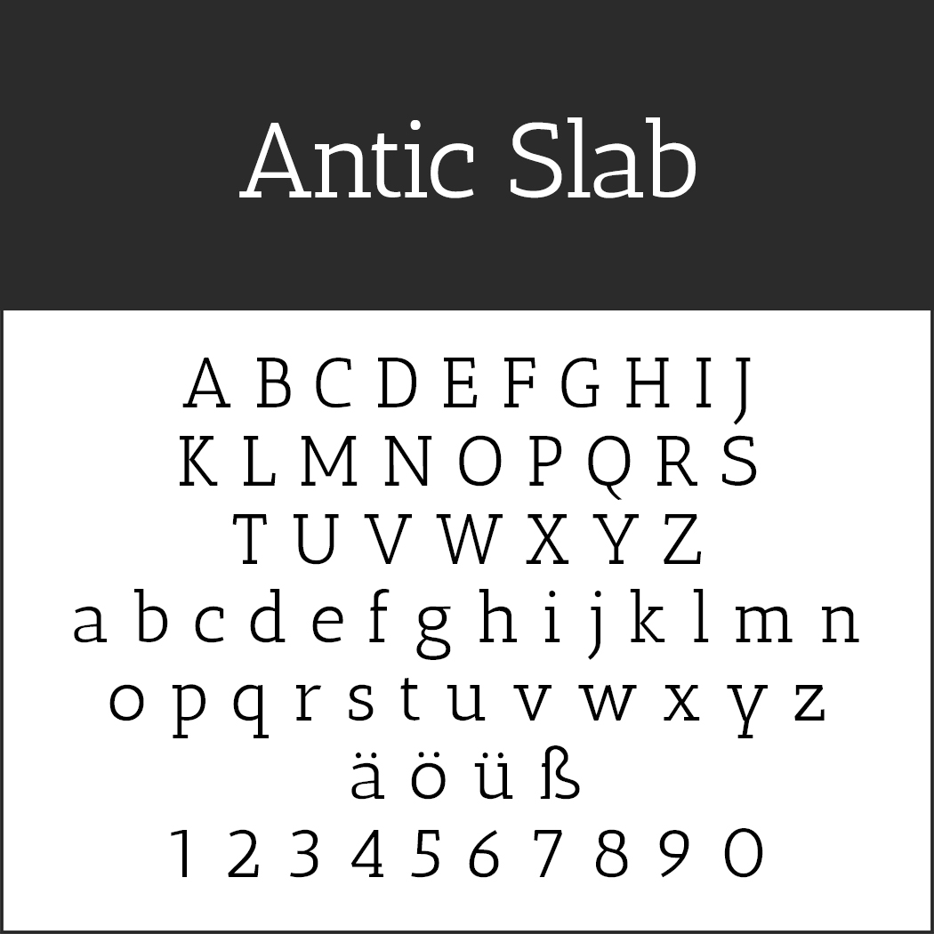 Antic Slab
Designed especially for headlines of newspapers and magazines, this modern slab serif font is also excellently legible on websites.
- License: SIL Open Font License (http://scripts.sil.org), Readme file in the .zip folder
- Download: ZIP file
- Font format: TTF
- Design by Typemade
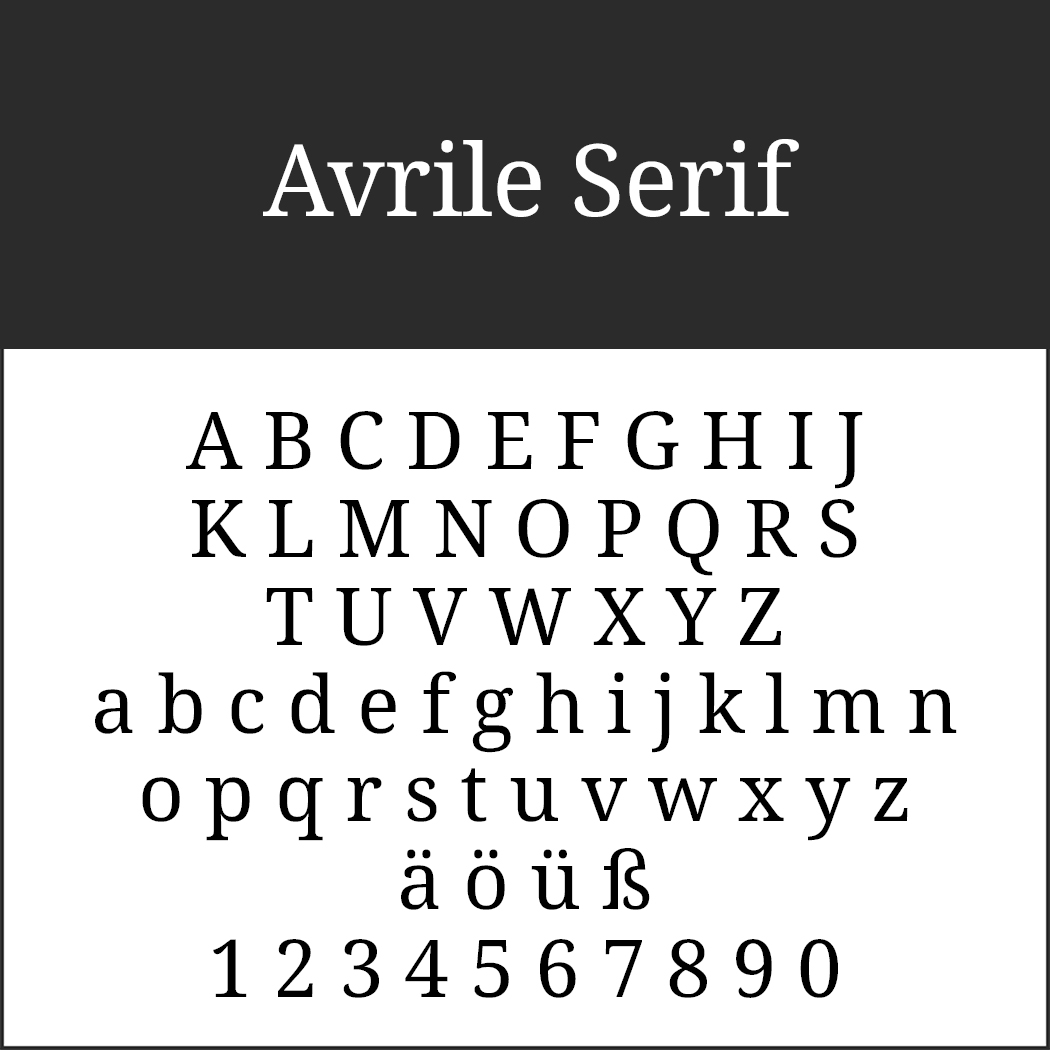 Avrile Serif
The designer of Avrile Serif delivered a modernised version of Noto Serif with this font.
- License: SIL Open Font License (http://scripts.sil.org), Readme file in the .zip folder
- Download: ZIP file
- Font format: TTF
- Design by Cristiano Sobral
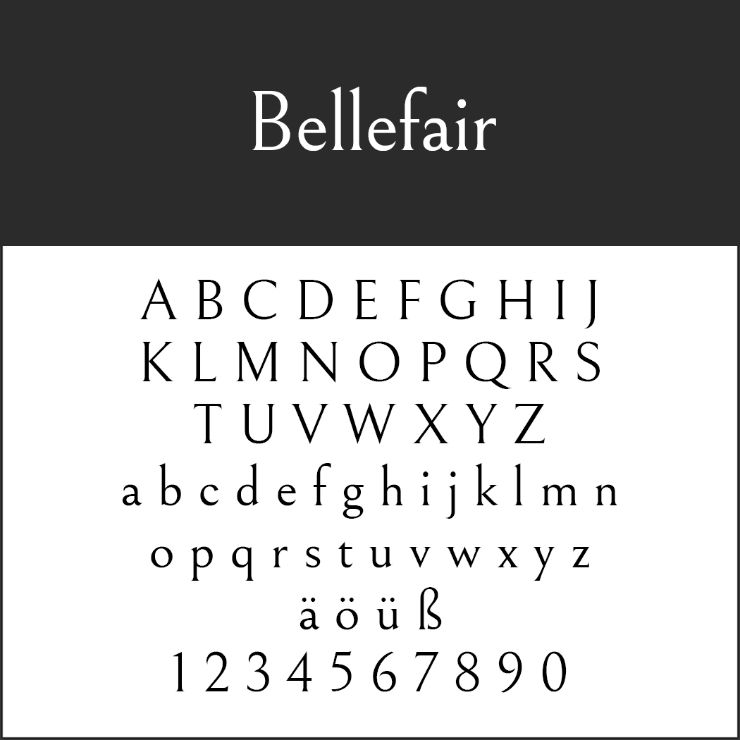 Bellefair
The noticeably higher ascender is characteristic of Bellefair which adds a touch of dynamic lightness in combination with the reduced stroke width of the letters and the very light serifs.
- License: SIL Open Font License (http://scripts.sil.org), Readme file in the .zip folder
- Download: ZIP file
- Font format: TTF
- Design by Shinntype (http://shinntype.com/)
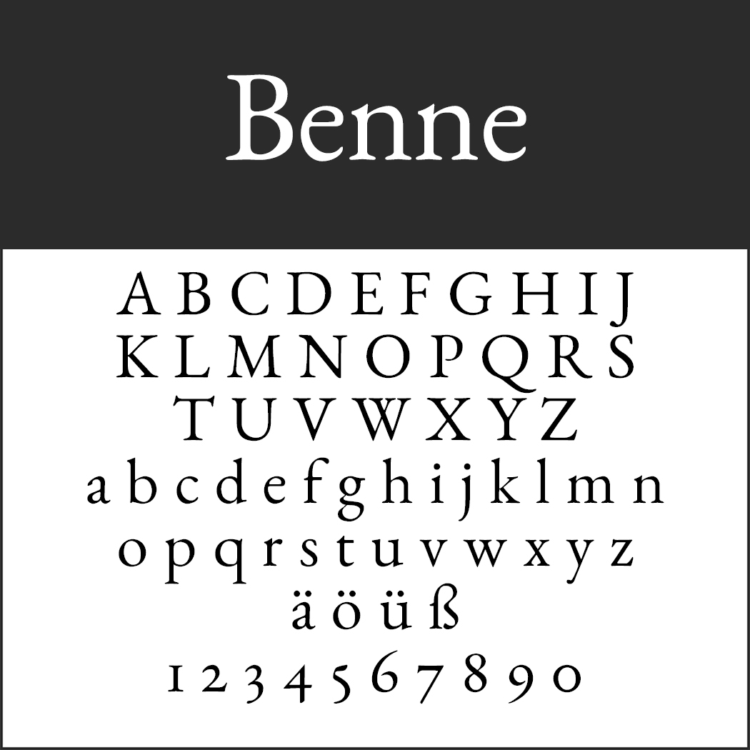 Benne
Benne
This font evokes images of Harry Potter. This typeface adorns the covers of the newer German and English book editions about the young wizard. It is ideal to add a vintage look to creative projects.
- License: SIL Open Font License (http://scripts.sil.org), Readme file in the .zip folder
- Download: ZIP file
- Font format: OTF
- Design by John Harrington (https://github.com/ShandonType/Benne)
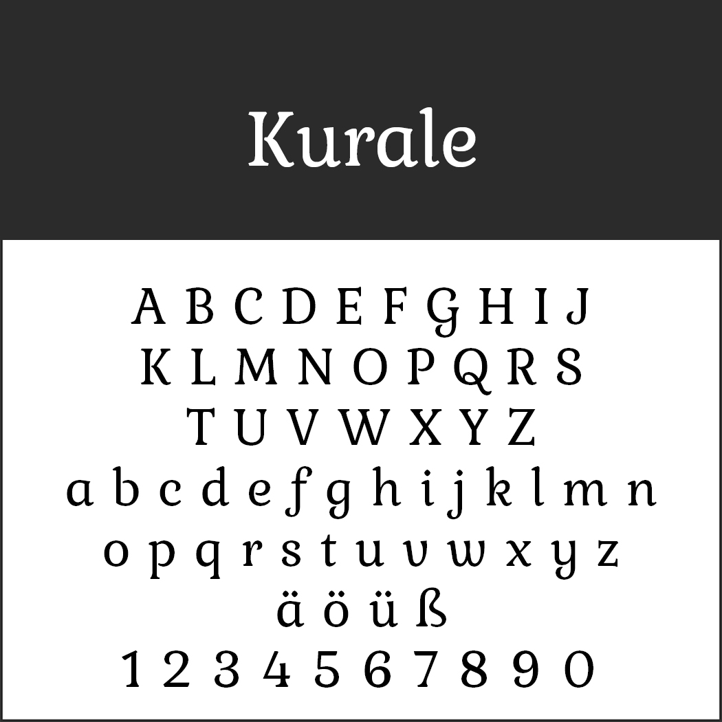 Kurale
Kurale is based on the Gabriela font and creates a particularly harmonious effect. Less well suited for body text, it shows off its beauty in short text passages and headlines.
- License: SIL Open Font License (http://scripts.sil.org), Readme file in the .zip folder
- Download: ZIP file
- Font format: TTF
- Design by Tipo (http://www.tipo.net.ar/)
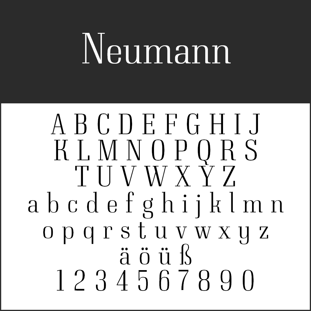 Neumann
This font is based on the 18th century Didone fonts but has a slightly more angular and factual appearance.
- License: SIL Open Font License (http://scripts.sil.org), Readme file in the .zip folder
- Download: ZIP file
- Font format: OTF
- Design by typedepot (https://www.typedepot.com/)
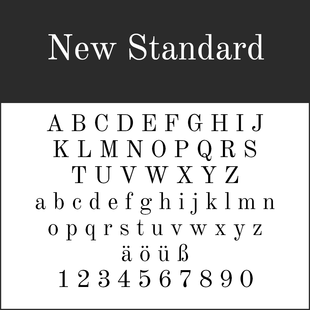 New Standard
Alexey Kryukov was commissioned by Adobe to create a digital version of a font from the first half of the 19th century named Old Standard. New Standard is the free version of this typeface.
- License: SIL Open Font License (http://scripts.sil.org), Readme file in the .zip folder
- Download: ZIP file
- Font format: OTF
- Design by Flanker (http://www.studiodilena.com/it/)
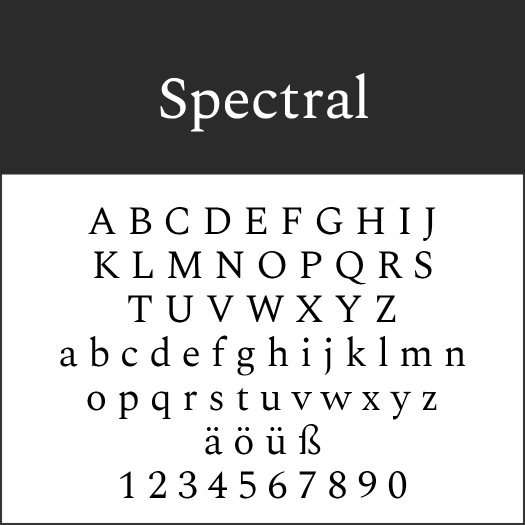 Spectral
Production Type developed a font on behalf of Google which is mainly intended for text-rich presentations. This is where Spectral works its magic.
- License: SIL Open Font License (http://scripts.sil.org), Readme file in the .zip folder
- Download: ZIP file
- Font format: TTF
- Design by Production Type (https://www.productiontype.com/)
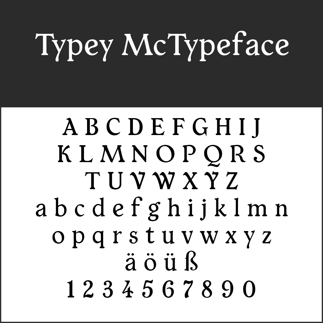 Typey McTypeface
This font combines elements of old fonts with refreshingly modern details, making it ideal for all festive occasions.
- License: SIL Open Font License (http://scripts.sil.org), Readme file in the .zip folder
- Download: ZIP file
- Font format: OTF
- Design by Paul James Miller