
Add a touch of retro charm to your photos by ageing them with the popular duotone effect. This basics tutorial will demonstrate the steps in Adobe Photoshop and the settings needed to obtain natural results with the duotone mode.
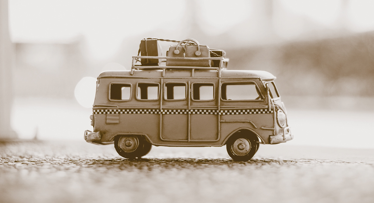
We have all browsed through old family photo albums and seen what the original effect looks like. Photos from the old days shot with ancient cameras and showing a variety of subjects. They all have one thing in common: a landmark sepia effect. This brownish tinge develops over time due to UV light which makes the black ink fade to a brownish hue. But sometimes the sepia effect is used intentionally to create a modern retro look usually for photos of vehicles or people.
What is the duotone mode?
The duotone mode is about combining a grayscale image with a second colour (usually a spot colour) to enhance the image effect or to create a special look such as the sepia effect. An image in duotone mode can also be printed as such. During the printing process, only the black ink and the specified spot colour are printed. Alternatively, it is possible to convert the finished duotone image back to CMYK mode and print it afterwards.
Step 1: Convert the image to duotone mode
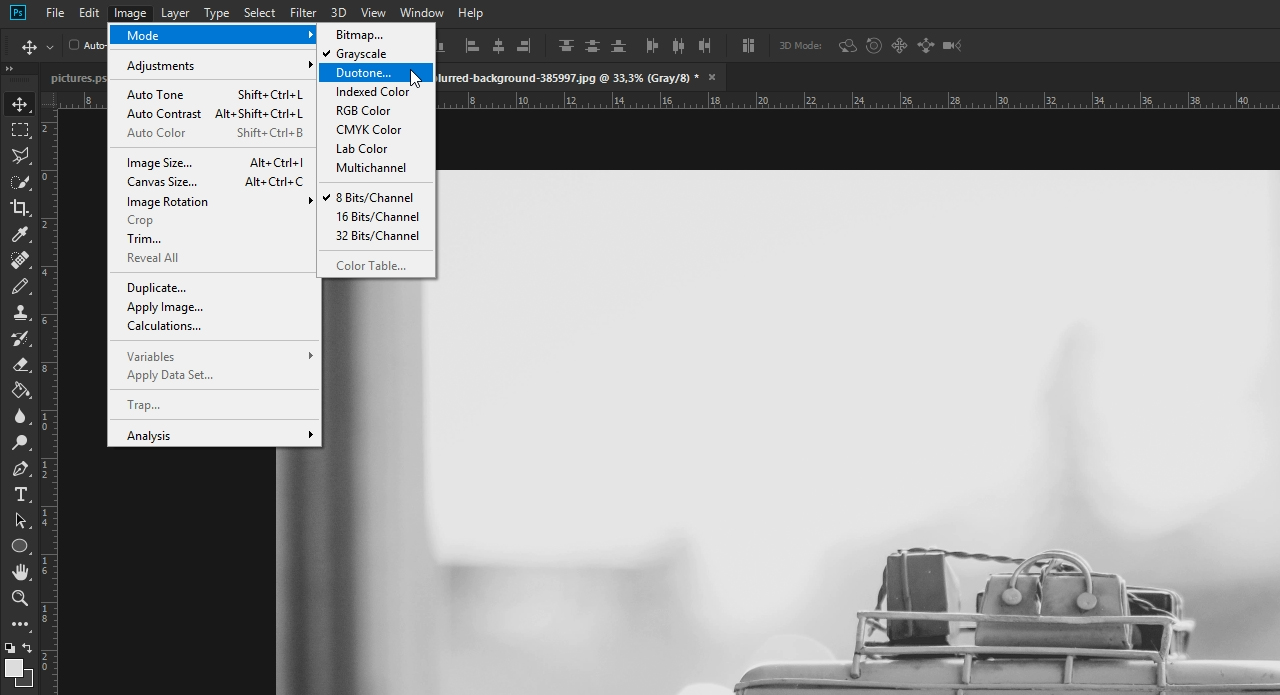
Click Image > Mode to access the duotone mode. It is usually greyed out in colour images. This is because the duotone mode can only be applied to grayscale or black and white images. So in order to apply the suitable colour mode, first convert your image to grayscale. Now if you go back to the Mode menu, the Duotone option is enabled.
Step 2: Understanding the Duotone Options dialog box
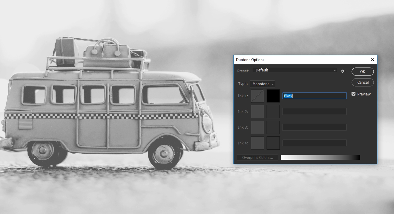
You can add up to four colour channels or inks in the Duotone Options dialog box. As the name “duotone” suggests, this technique allows combining two colour channels. By default, this window only shows one colour channel with black ink at first. Basically, a single colour would be sufficient to create the sepia effect. But if you replace the black ink with orange by using the colour slider, you get a kind of sepia effect but almost all contrast in the image will be lost so that it appears unnatural and flat.
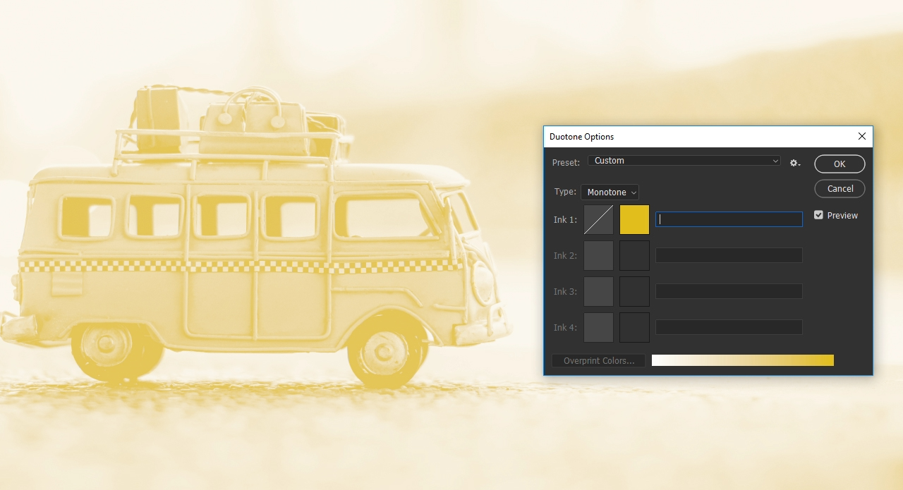
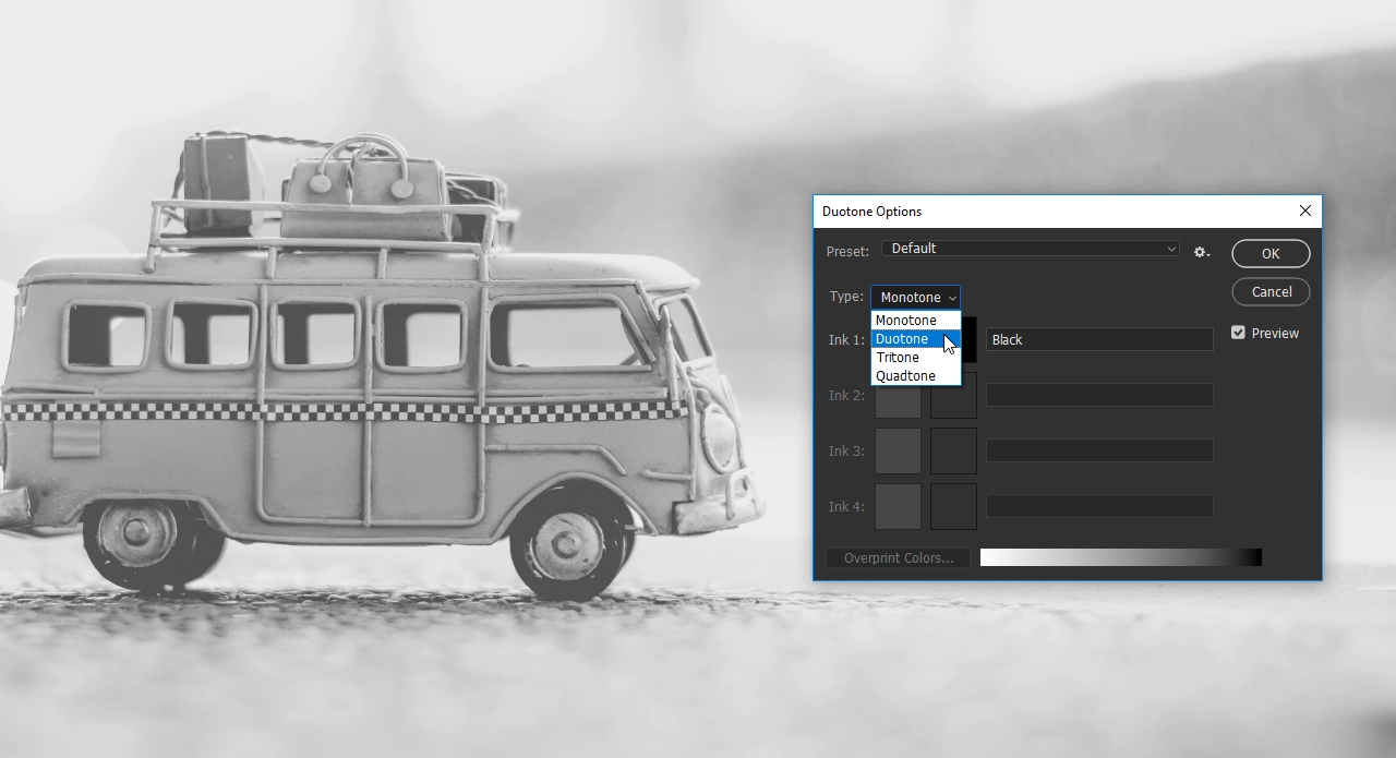
The black channel contains all relevant contrasts. So you should keep it and add another channel. You can add up to three additional channels using the Type drop-down menu. In this example, we choose Type > Duotone.
Step 3: Choose the colour and amplify the contrasts
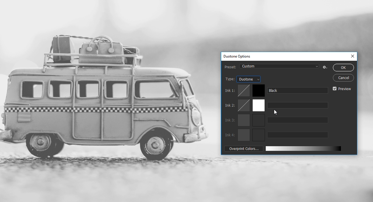
After you have set the type to Duotone, click the small white box to open the Colour Picker. Here you can choose the colour you like best. For a realistic sepia effect, we recommend orange; the value “db9d19”.
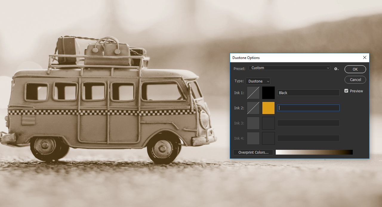
Having chosen the second colour, close the dialog box again by clicking OK and subsequently adjust the contrasts in the Duotone Options dialog box. This is done with a simplified version of the Duotone Curve settings. To get there, click the second box (with the white diagonal) to the left of the ink field. In this example, we want to amplify the contrast of the bus a bit.
The duotone curve
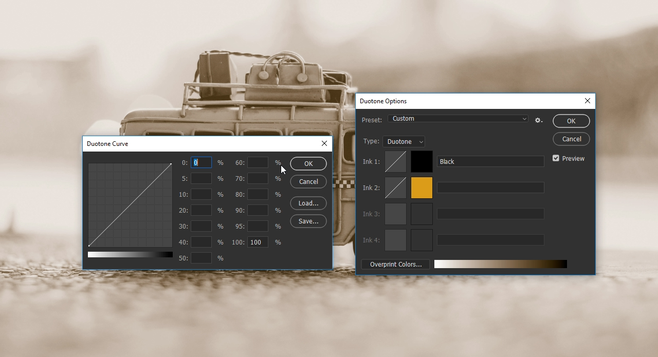
In the left of the dialog box, you see the duotone curve which is displayed on a grid. A bar directly below indicates the brightness value adjusted with the duotone curve. It represents the entire tonal range of the image and ranges from the highlights (the brightest areas in an image) to the shadows (the darkest area). Click the duotone curve in the grid to set a curve point which you can drag only vertically. As you adjust the curve, values are automatically entered in the percentage text boxes. So if you have set a curve point in the fourth box of the grid and moved it, the corresponding percentage is displayed at the value “40”.
The setting options
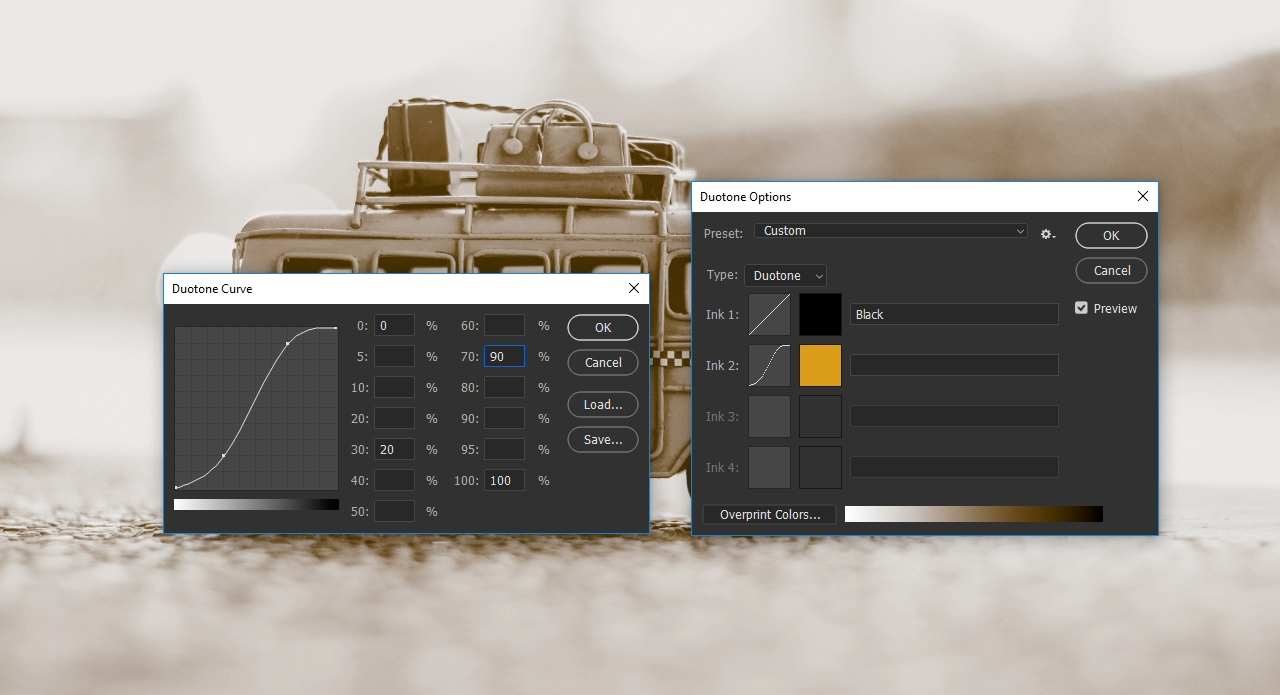
On the right of the duotone curve you can also enter the colour changes directly in the text boxes in ten percent increments. If you enter a different value at “30”, for example, the duotone curve on the left will change accordingly in the third box. This is what we want to do in our example. We want to reduce the tonal range at “30” by 10 percent. To achieve this, you can either pull down the curve point at the third box by 10 percent or you can enter the percentage “20” at “30”. Initially, we lose a bit of contrast with this setting, but we can restore it with the darker grayscales. In this example, the tonal range is increased to 90 percent at “70”.
Finally, close the dialog box by clicking OK.
Tip: You can apply the duotone curve to each channel or ink and manipulate them. This allows you to implement a high level of detail when editing your photos.
Step 4: Confirm the duotone settings
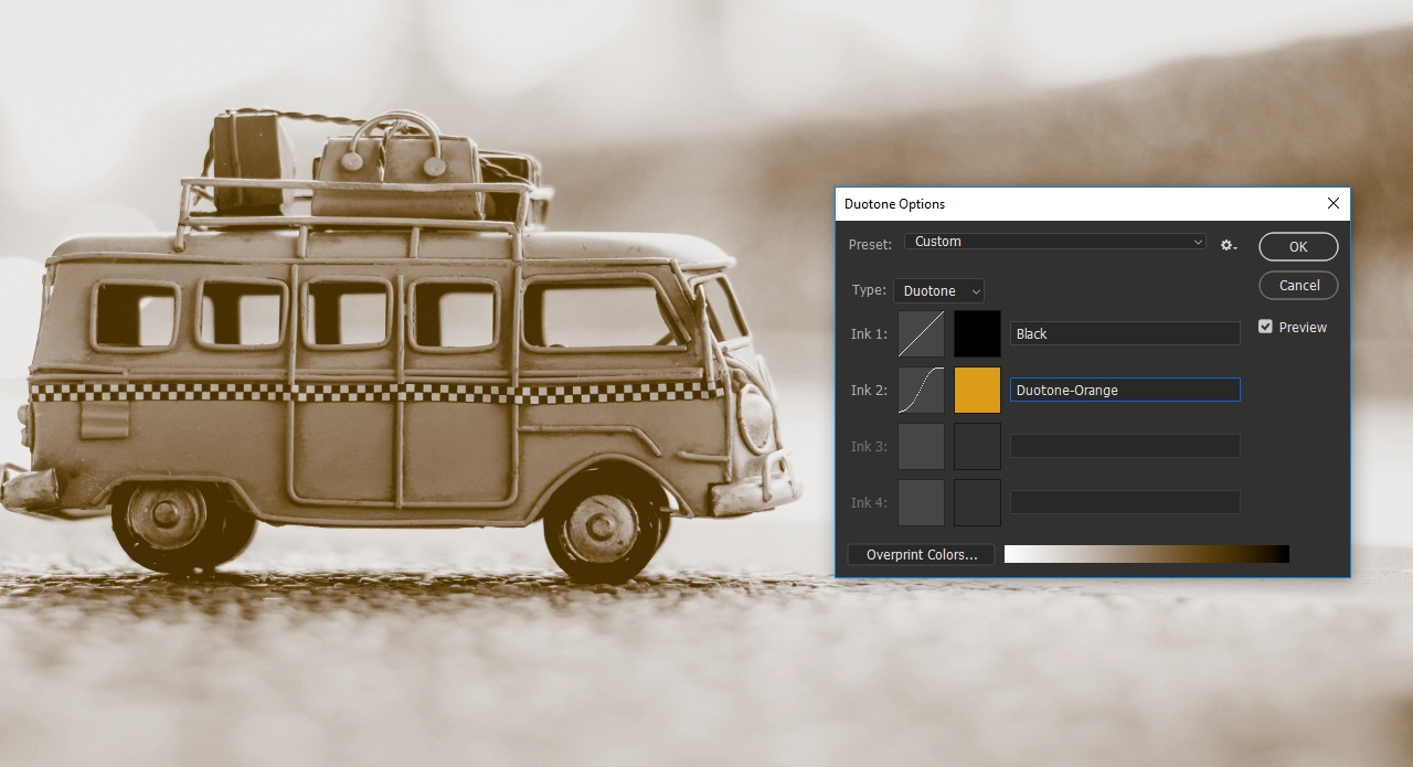
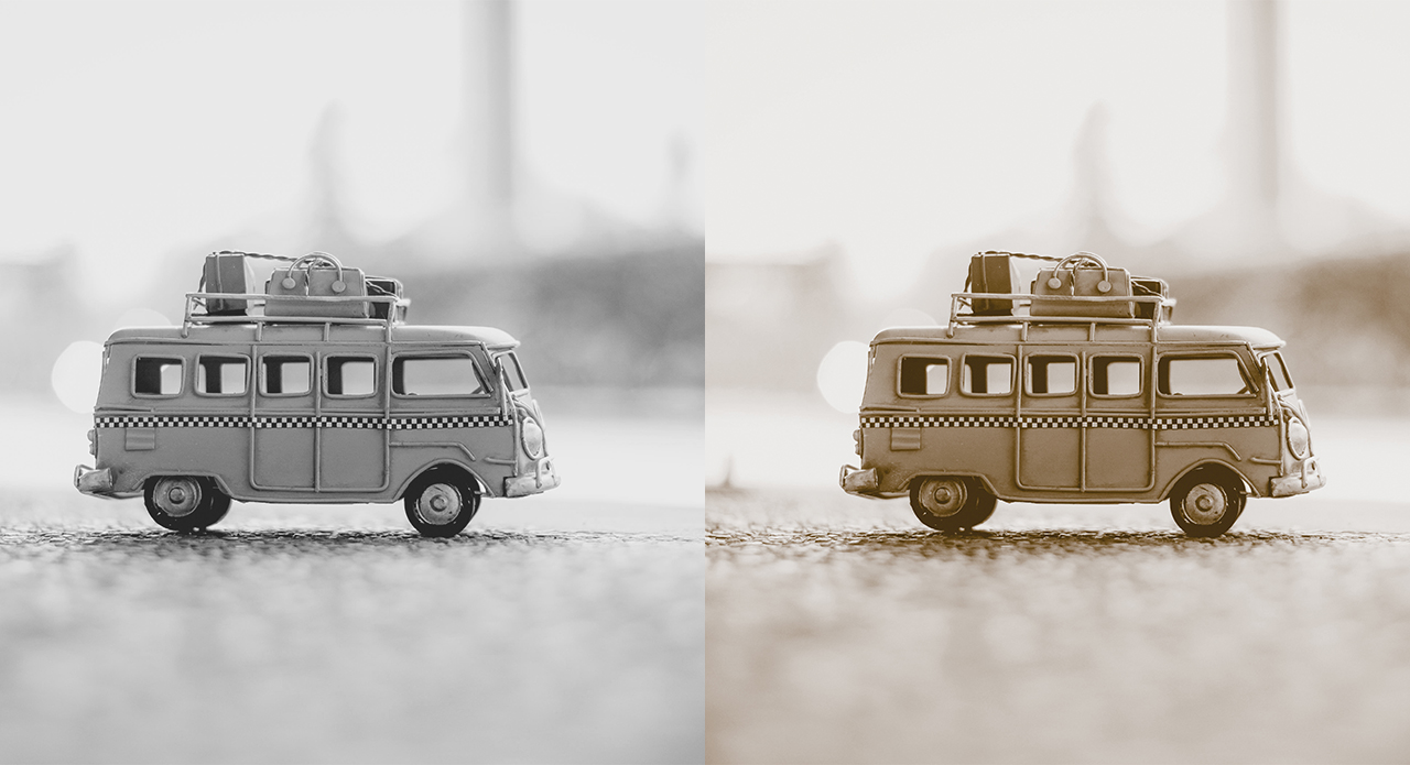
Before closing the Duotone Options dialog box, you have to name the newly created colour. You can specify any name, but it is advisable to choose a name that can be clearly assigned such as “duplex orange”, particularly if you want to print the image later on. Once the name has been assigned, close the Duotone Options dialog box. You have successfully created the sepia effect and you can now further edit the image.
Bear in mind that the image is still in duotone mode. This means that it comprises two colour channels only. For optimum further processing of the image, you should convert the image to RGB mode subsequently, or if you want to upload it to a print shop, to CMYK mode.
Credits:
Tutorial and design by Christoph Ullrich, media designer.