
Everyone knows the Metallica font which has become popular not just with fans of the famous heavy metal band. But where can you get it?
For a few years, writing one’s name in the Metallica font has been all the craze on social media. Originally used by Metallica fans only, the habit was also taken up by other users that are not so much into the band. This is understandable since the Metallica logo is a real head-turner thanks to its visual trademarks: the extra added descenders on the first and last letter. It creates a modern and quirky impression – perfect for everybody who is or wants to appear nonconformist. You can use fonts or a text generator to design your unmistakable Metallica look.
What are the origins of the Metallic font?
As many logos that of Metallica is not based on a font either. It was James Hetfield, the band’s lead singer and guitarist, who designed the famous logo.
In 1981, Lars Ulrich founded Metallica in California. The logo as we know it featured on the cover of their first album Kill ‚em all. The following albums Ride the Lightning (1984) and Master of Puppets (1986) showed a 3D version of the same lettering. The logo was radically changed on the album covers of Load (1996) and Reload (1997): The letters are narrower, the extenders of the first and last letters are only slightly elongated downward.
The original logo was used again for some further albums: Garage Inc. (1998), Death Magnetic (2008) and Hardwired … to Self-Destruct (2016).

Metallica typeface: rock that font
Although the typical Metallica font is not suitable for longer text passages, a font is available for the logo and lettering, respectively, which featured on the 1996 Load album for the first time. In terms of quality, however, the two fonts leave a lot to be desired.
Note: We have checked the commercial availability of the fonts, but we cannot warrant this. So please check out the font license information and notes on the website you are downloading your font from.
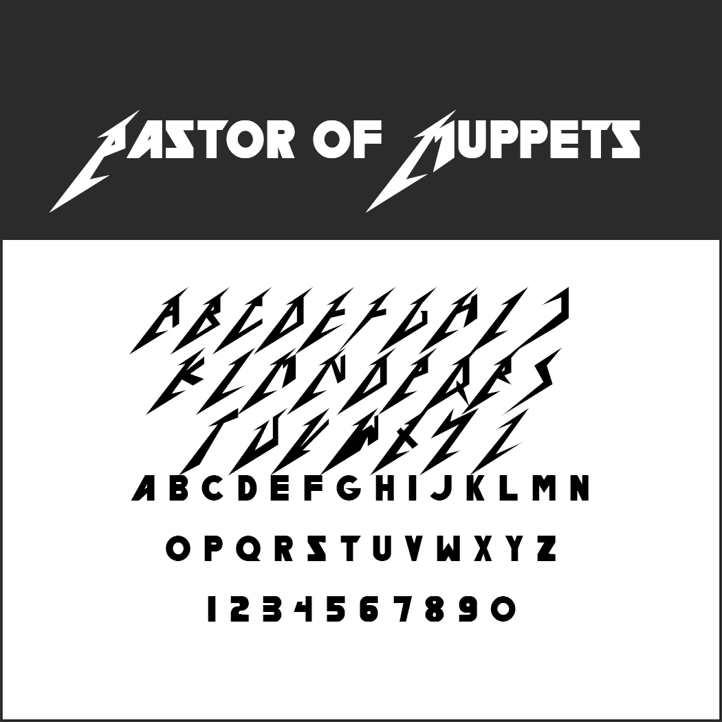 Pastor of Muppets
The Canadian Ray Larabie designed this font on the basis of the Metallica logo. It provides all upper-case letters, with the exception of umlauts, in the centre and outside left version. However, it does not include the letters with the descenders on the right outside for the end of the word.
- License: unknown, readme file in the ZIP folder
- Download: ZIP file
- Font format: TTF
- Design by Larabie Fonts
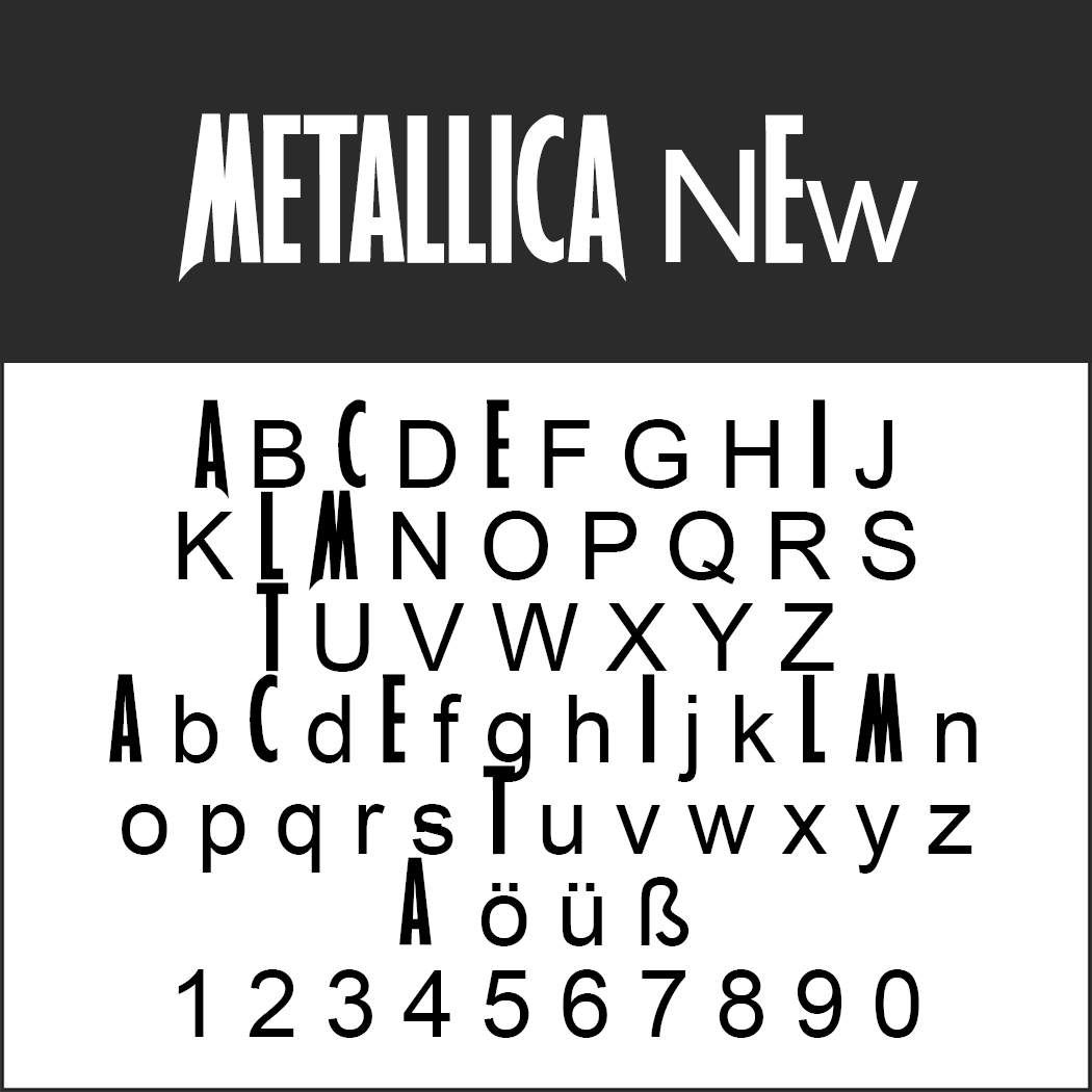 Metallica New
Strictly speaking, this is not really a font. It includes just the letters of the logo with the rest of the alphabet added in a neutral font. So it can only be used for words that begin with an M and end with an A and have a combination of letters from “ETALLIC” in the middle. For all other purposes, it is useless.
- License: unknown, readme file in the ZIP folder
- Download: ZIP file
- Font format: TTF
Metallica font: the official text generator
The easiest way to get the Metallica lettering is by using a generator. This is perfectly sufficient since you would never use this font for a longer text passage anyway.
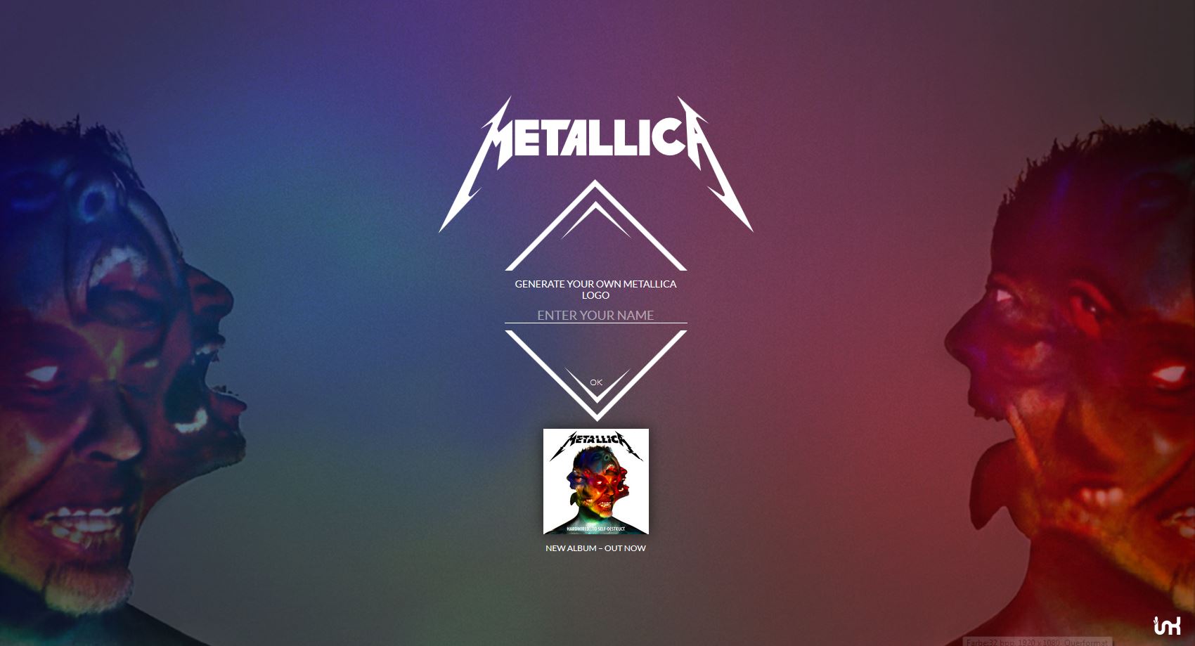
They made the text generator available at metallica.allwaysdata.net to promote Hardwired … to Self-Destruct. So it’s no wonder that the lettering has been spreading like wildfire on social media since 2016 – the more so because the band itself asked its fans to do so.
The procedure is self-explaining: To Metallica-ize your name, just enter the word, click OK and share it on social media or download it as a JPG file. It is also possible to enter multiple words. Only the first and last letters have that special slanted look with the descenders. The letters in-between are “normal”.
Bilder: http://metallica.alwaysdata.net, Kreepin Deth via https://en.wikipedia.org/wiki/Metallica, ne2pi via Shutterstock