
Ambi-what? You have no clue what an ambigram is? That’s a shame really because ambigrams are special. They add a modern, tasteful and contemporary touch to designs. However, creating an ambigram requires a good deal of artistic talent and careful preparation. We have created a tutorial on the subject in time for the first “Ambigram Day”. In this tutorial, we will demonstrate the different steps involved in creating an ambigram and the best approach to designing one.
Contents of the article
- Figure out the letter pairs
- Choose an appropriate font
- Select the suitable case
- Match the letters and highlight similarities
- Try, discard, correct
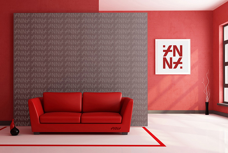
A lot of companies use ambigrams in their branding, including Deutsche Bank, the online travel agency Opodo or the consumer electronics company Sonos. Ambigrams are a special type of word/figurative marks. They are often incorporated in logos because they have point rotation symmetry and look the same when flipped 180 degrees. They became famous through Dan Brown’s best-selling novel “Angels and Demons”.
Ambigrams used as word marks must be visually appealing and easy to read. This is the challenging part and often requires the most time and effort. Finished ambigrams have a logical and consistent appearance to them. Designing an ambigram requires abstract thinking, artistic design skills and a structured approach.
In its simplest form, an ambigram can be created directly from the available letters of a word without having to change or reposition them. A palindrome might be suitable to design an ambigram. It is a sequence of letters that reads the same backward and forward such as “OTTO”. The latter can be turned into an ambigram with only a few changes: “o++o”.
Things get more difficult with longer words and different sequences of letters.
The steps of creating an ambigram
We will use an example to demonstrate how to design an ambigram step by step:
Step 1: Figure out the letter pairs
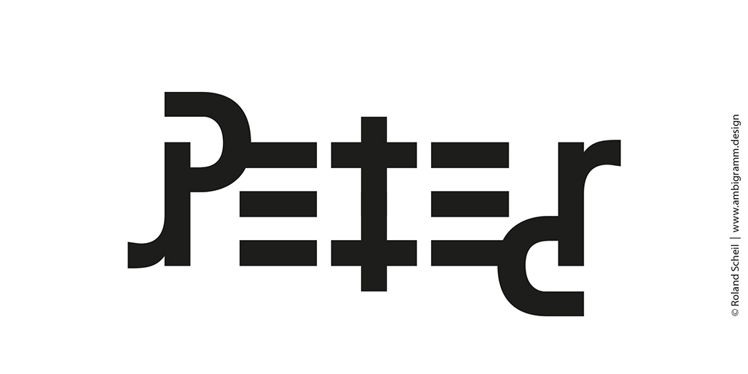
Let’s assume you want to create an ambigram of the name “Peter”. The first step is to match the letter pairs you want to combine:
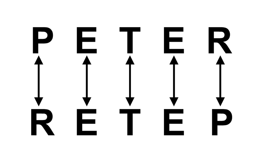
The word “Peter” has the advantage that the three letters in the middle are already identical. This is the exception rather than the rule. When tackling longer or more complex words with an odd number of letters, you can group two or more letters and then match these groups to each other. For this basics tutorial, however, we will use an easier example. So in this case, we only have to match these three letter pairs: R and P, E and E, T and T.
Step 2: Choose an appropriate font
Which font to choose depends on how easily it can be modified and the result we are aiming for. Do we prefer an ornate or no-frills appearance? Sans serif fonts tolerate some modifications better than serif fonts or Fraktur typefaces. In our example, we picked the clear and familiar Univers Condensed typeface. It is a geometric and condensed font with optimum reading properties.
Step 3: Select the suitable case
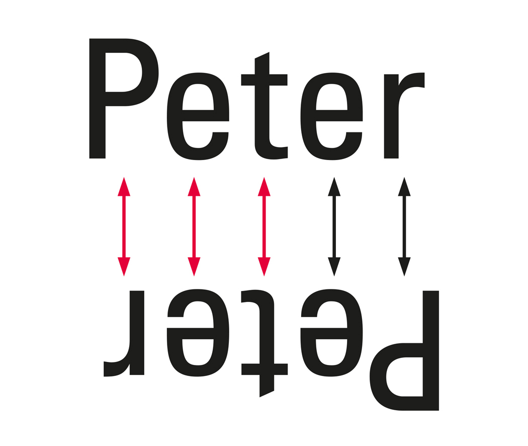
This step may come before or after font selection. Step 2 and step 3 often merge seamlessly. Graphic design skills and experience are important in this. In our example, we choose the most common way to write “Peter” using majuscules (capital letters) and minuscules (small letters). “PETER”, “peter” or “pETEr” would also be possible depending on the selected font and our design idea. I have another variant up my sleeve, but that is for later.
Step 4: Match the letters and highlight similarities
Sorting and matching the letter pairs P and r, e and e, t and t becomes clearer when we use two different, contrasting colours. The colours black and red highlight where we need to adjust, omit, delete or add something.
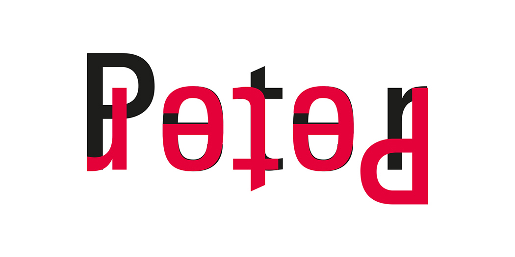
Step 5: Try, discard, correct
The actual creative process begins in step 5. As with all creative achievements it is difficult if not impossible to foresee the final outcome and effort involved. The creative process is more efficient when you are aware of necessary detours based on experience but still take an open-minded approach.
To reach the final result, we have slightly squeezed the letters together, created negative spaces from the overlapping areas, adjusted stroke weights, simplified, and repeatedly rotated and compared the elements.
The finished ambigram of the word “Peter” looks like this:
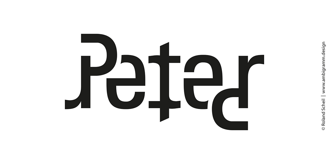
The major modifications can already be guessed after putting the words on top of each other, but only the final changes turn it into an elegant ambigram. Alternatively, you can use small caps to give the ensemble a more angular look:
Try it out! – Caution: Highly addictive!
There is no one “ideal” or “only possible” ambigram solution. The ultimate result is influenced by one’s individual preferences, the linguistic background and the available fonts. All the more reason to just get started and see how far you get. But a word of warning: Designing ambigrams can be addictive.
 About Roland Scheil
Roland Scheil, the author of this tutorial, is a freelance graphics designer and art director. Studying visual communication in Wiesbaden, he is a specialist in ambigram design and promotes the use of ambigrams. To learn more, join his Xing group. For more information, go to www.ambigramm.net.
International Ambigram Day
Roland Scheil announced 20 July 2016 as the first Ambigram Day. For more information, go to www.ambigramm.net.
Get started and design an ambigram!
For more examples designed by our guest author Roland Scheil, see


© Roland Scheil www.ambigramm.design